How I Paint Space: Multiperspective Arrangement
Note: This blog post has been completely rewritten and published as a paper. Please read and/or cite the paper, as appropriate:
| A. Hertzmann. Comparing Perspective in Drawings, Photographs, and Perception. Art & Perception. 2025. [Paper] [Preprint] |
This post describes how I think about perspective when I’m drawing and painting. By perspective, I mean creating a sense of 3D space in a 2D picture. Classical theories treat perspective as a specific rigid principle that doesn’t accurately describe how artists or human vision actually work. Since the Modern Art era, a lot of art instruction (including my own) treats perspective as freeform, without any particular rules or principles. I think there’s more to say about it.
When I draw and paint, perspective is about arrangement: about arranging shapes on the page. It’s not about reasoning about projections from 3D to 2D. Moreover, drawings are multiperspective: different parts of the page correspond to different viewpoints or eye directions.
The approach I’m describing here are observations of my paintings. That is, I paint pictures, and, then afterwards, notice patterns or trends in how my pictures came out. These observations have informed my theories of perspective, and those theories have, in turn, led to more nuanced analysis of my own drawings, and influenced how I draw new experiments. (It’s hard to know influences for sure, e.g., David Hockney’s body of work is inspiring, as well as the history of multiperspective photography, and Rob Pepperell’s writing.)
I’ve been thinking about this for a long time, but I haven’t had pictures that illustrated these concepts well, for various reasons. Only since my recent sabbatical, do I finally have some pictures that I think can illustrate how these principles emerge in my own drawings.
Wide-angle versus narrow-angle depiction
With an initial exception, all of my discussion on this page are wide-angle depictions. This means that any normal photograph of the field-of-view that I’m capturing would create distortions. For wide fields-of-view, artists and photographers often end up making different kinds of pictures from the way normal linear perspective photography works.
In contrast, here’s a narrow field-of-view sketch that I drew in July:
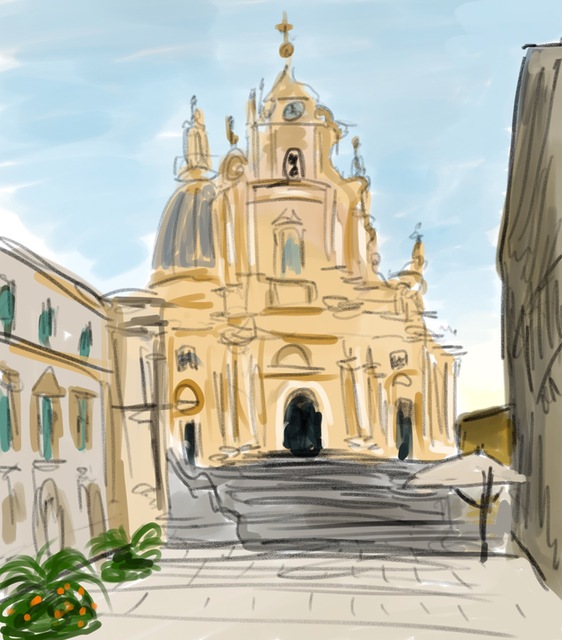
To my surprise, it aligned quite well to a photo taken at the same time:
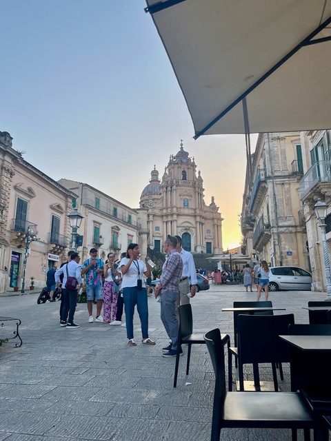
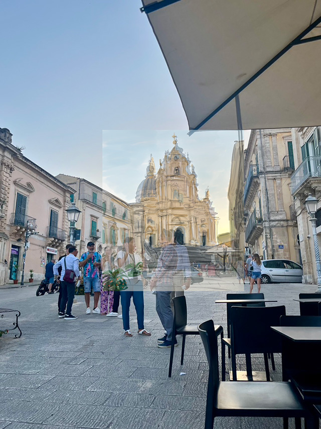
despite the fact that I’d not been the least bit methodical about it:
(The above photos are wide-angle, but, if one just takes the center portion, then centers are narrow-angle.)
I find this drawing makes me believe more in narrow field-of-view as a “perceptually-accurate” depiction technique. It’s not conclusive evidence—perhaps I’ve trained myself to draw this way, but I doubt it.
Photos are misleading!
Before going into any more specific examples, I want to make a point that is important to me.
In each case, I will show a photograph that I took after drawing the picture. But I really do not like showing the reference photos, because I think that the reference photos are misleading: they create such compelling and seductive illusions of reality that we mistake them for reality.
I often find myself comparing the drawing to the photo and thinking that my photo doesn’t look right because it doesn’t look like the photograph. Then I have to remind myself that the photograph doesn’t look like what I saw. Photographs are not objective; they are the product of an enormous number of choices made by camera manufacturers to make good-looking pictures. In wide-angle pictures, i.e., all the examples below, they systematically create misleading shapes.
For example, here’s a quick sketch I made while looking out of an airline window, together with a photo taken at the same time:
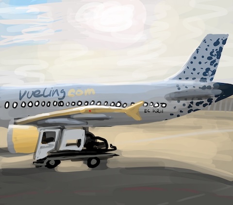
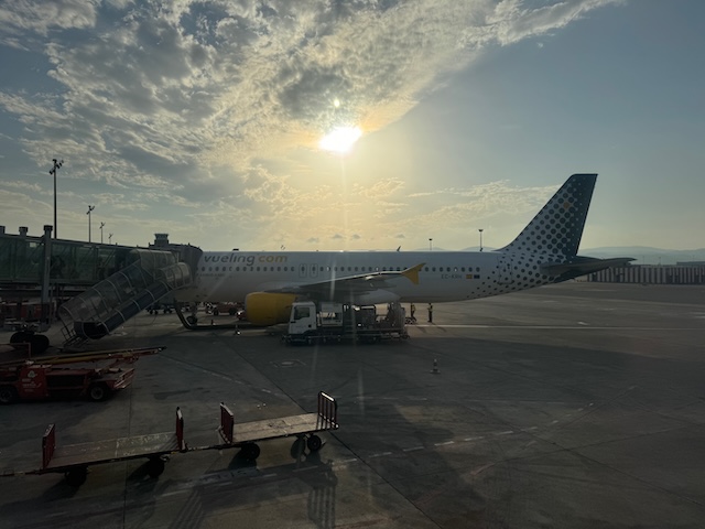
Bright sunlight shone right in my eyes, reflecting off the tarmac and suffusing everything in view. My painting shows this, whereas the photograph makes most of the scene look rather dark.
In each case, my painting and the drawing are both two different ways to depict what I saw. Neither is “right” or “wrong.” There are lots of good reasons to prefer the photograph, or to describe it as “more accurate”, but the photograph is misleading in lots of ways. It itself is not the “ground truth” scene according to which the drawing should be measured.
When I write about how the painting and the photo compare, I constantly find myself about to say something like “I’ve made the picture brighter than the photo” as though the photograph is the starting point, or the “true” picture. In writing this blog post, I’ve had to make a conscious effort to avoid this.
Morning coffee: Composition and simplification
I’ll begin this story with a relatively simple example, of my morning coffee while trying an Oxford coffee shop that my friend Amanda had recommended:
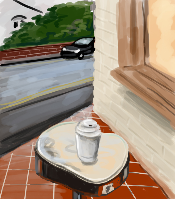
For comparison, here’s a photo that I took at the same time.
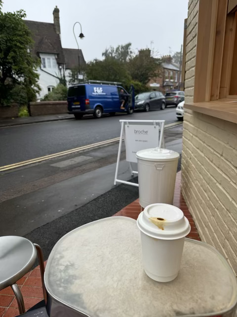
In the photo, we see a complex space, with a bunch of different objects and elements. In my drawing, I’ve simplified the scene to have a three-part design: the road on the left, the wall on the right, and the triangular floor-plus-table on the bottom. I’ve clearly left out many of the objects and details, e.g., the different cars and the trash can. It’s almost like three separate paintings, arranged in a 2D design.
Some of these choices are the result of time constraints: it’s simply too time-consuming to try to draw every detail. But it’s also not necessarily a better to do so either—if you want every detail, take a photo.
Another common theme here—as well as in many professional artists’ work–is the way that the ground slopes away from the viewer much less than in the wide-angle photograph, making distant objects larger in the drawing than in the photograph.
I also find that my drawings of objects (like coffee mugs) become fronto-parallel unless I really consciously work against it (and I rarely do).
In these latter two aspects, I see similarities to some of Matisse’s studio paintings, e.g.,:
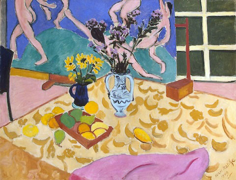
It seems like Matisse has drawn each object as a separate fronto-parallel portrait and put them on a tilted plane, and I feel like my sketches and drawings often look like that to.
The same thing appears in some pre-Renaissance perspective, like this 14th Century painting:
Railways and roads: Simplification and foreshortening
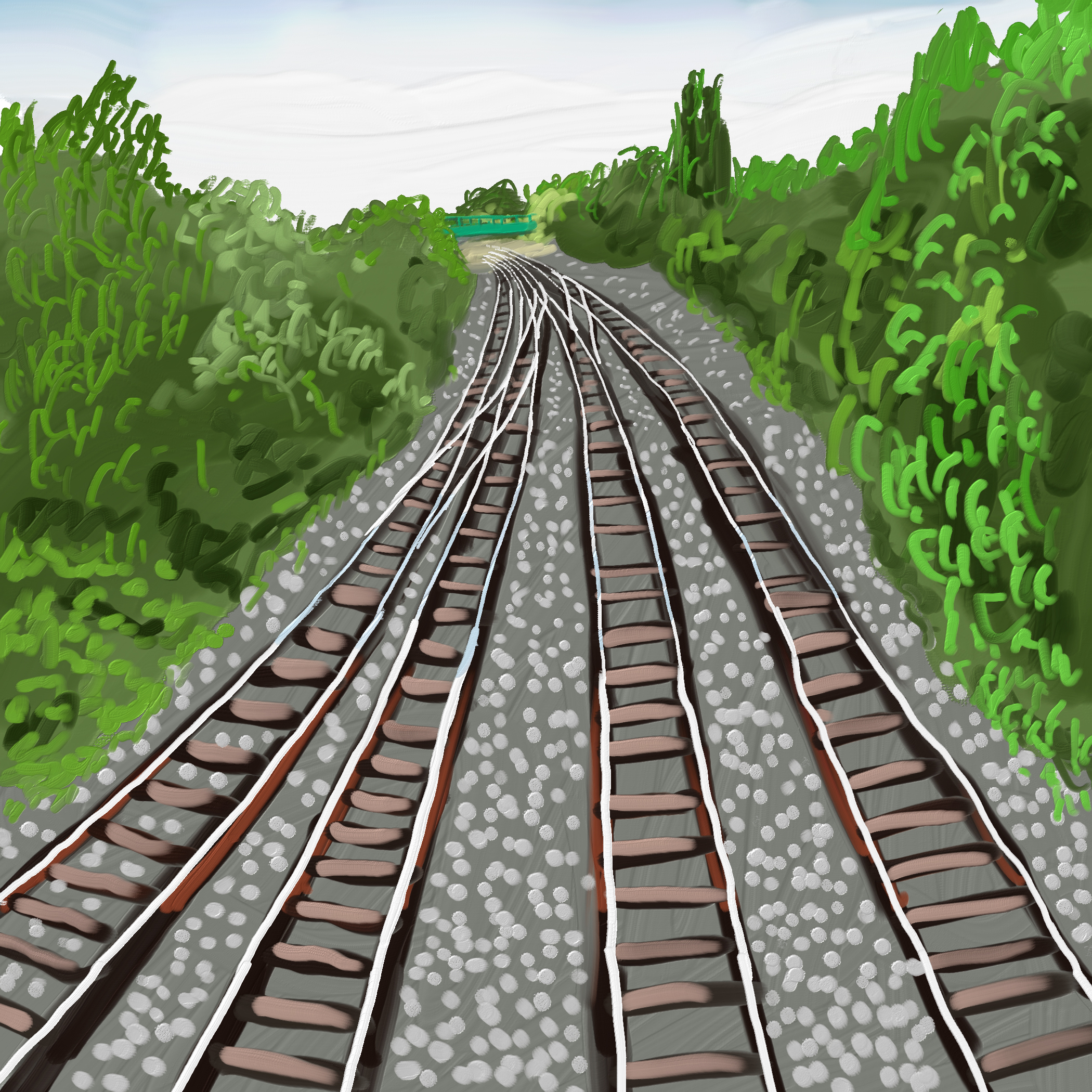
A few days later, I painted this picture, on a bridge over a railway by the Oxford train station:
And here’s a photo that I took at the same time (original, and cropped to match visual angle of the photo):
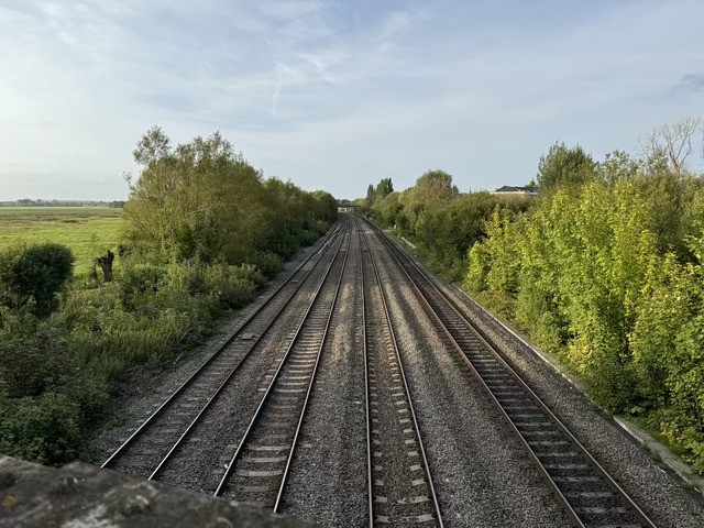
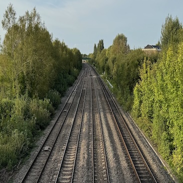
Again, comparing the two, you can see different tilts of the ground plane. Again, I did not consciously reason about this, I simply attempted to draw what I saw. You can also again see a considerable simplification of the contents, segmenting the scene into just a few distinct regions.
Interestingly, if you crop out the relevant part of the photo, and scale it to match the size of the canvas, it looks pretty similar to the painting. This would suggest that the canvas size itself is an important factor:
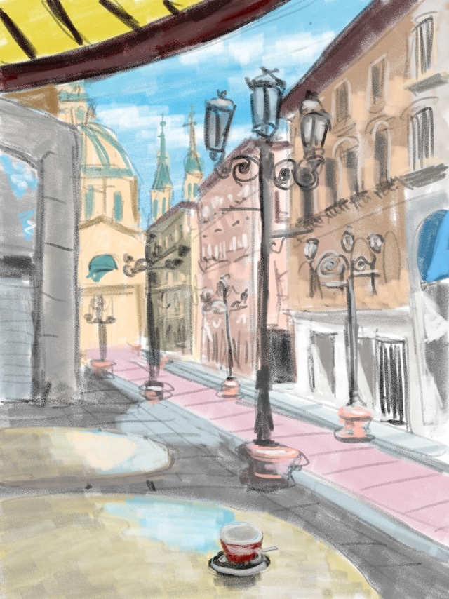
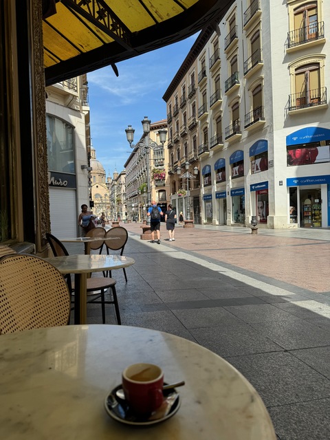
Here’s a more complex example, of Calle de Alfonso I in Zaragoza, where distant objects appear larger in my drawing than in the photograph, a common theme in perception versus photography. Many objects are removed as well, and the drawing is much lighter—it was a very bright, sunny day.
Natural History Museum: Complex 3D space
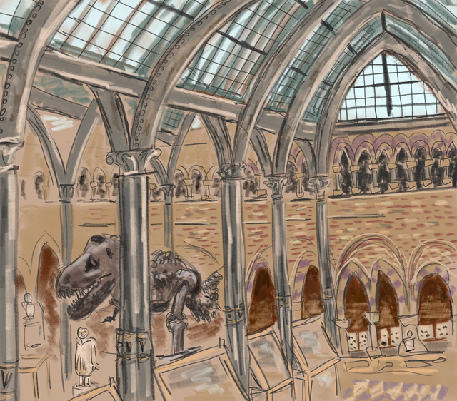
Now I’m going to change gears a bit, to discuss more fine-grained 3D compositional choices. Here’s a picture that I drew in the Oxford Natural History Museum
And here’s a photo that I took at the same time:
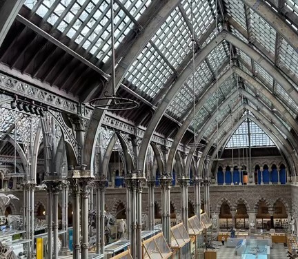
There’s a lot to say about the changes that I made while drawing, both consciously and unintentionally. As you can see, the actual space is enormously complex, full of details, and so I couldn’t draw everything. The photograph is misleading, in fact, in that it downplays just how many finescale details there are. When you’re in this museum—or any space—you can’t even truly see them all the details around you.
Many of the changes can be described in terms of the objects in the space. I reduced the number of pillars. There are lots of little details that I removed, like rows of bricks.
I wanted the dinosaur skeleton to be more prominent than it would have been, so I moved it and made it bigger relative the pillars near it.
La Seo: Simple but detailed
Here’s my favorite picture from my sabbatical, drawn in La Seo:
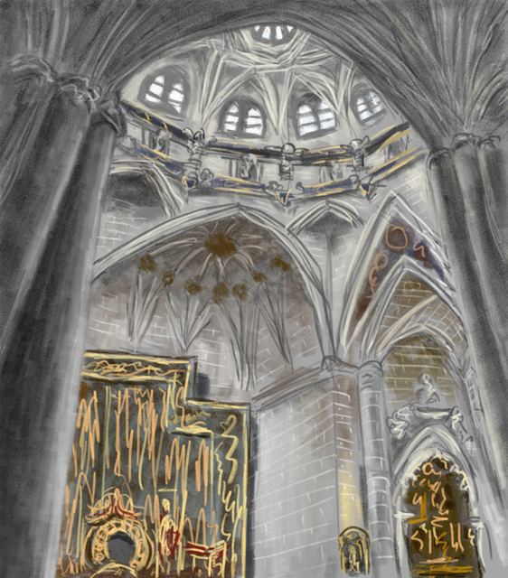
Unfortunately, I didn’t take a photo at the same time. From looking online recently, it seems like the object in the lower left might be the main alterpiece.
When I first walked into this cathedral, the idea of depicting it seemed overwhelming. The spaces are vast and filled with details. When I Google search for photos of the cathedral, the results include a lot of extreme wide-angles.
In this picture I found a way to create a composition that seems comprehensible, organized around an arc, and then additional details filling it out. Lots of details were removed, rows of bricks, fine filligree work, and so on.
Putting pictures together: compositional multiperspective space
As I look over wide-angle pictures I’ve drawn over the past few years, I start to see them in terms of multiperspective compositions. And now, when I draw them, I think of them this way as well. That is, I’m consciously arranging parts of the scene each with their own perspective. Sometimes this approach can create an effective sense of 3D space, and other times the multiperspective nature is more visible.
Here’s a painting from a few years ago. Again, not my favorite drawing, but one that I think illustrates the main ideas:

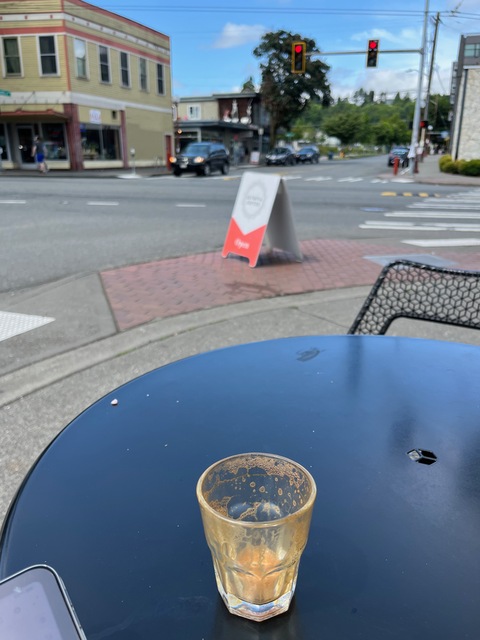
Let me try to explain what I think is going on here:
- I wanted to capture a wide vertical angle, spanning from the coffee (cortado) on the bottom, to the sky above. The photograph captures this same wide angle, but not in a way that matches perception.
- My drawing partitions that vertical range of space into a few zones, from bottom to top:
- The table, and on it, the coffee
- The sidewalk with the coffeeshop’s sign
- The street intersection
- The buildings on the street
- The street and stop lights
- The sizes of these zones are (a) proportional to perceptual sizes, but (b) squeezed to fit into the canvas. There’s no sense in which they’re “metrically” accurate.
- The zones fit next to each other, and the streets are continuous. Sometimes long shapes (like streets) bend in order to fit
- Objects are drawn as “head-on”, rather than with perspective distortions. For example, linear perspective makes the vertical lines angled whereas they’re vertical in my drawing.
If these points aren’t necessarily clear in my drawing, they may be clearer in some of the other examples below.
Something similar happened in this drawing from 2021, where the road slopes away from the table:
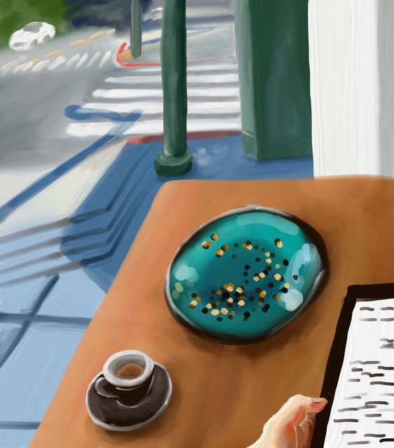
Unfortunately I didn’t take a photo with it.
Sometimes the multiperspective nature is apparent, such as this 2021 drawing from a friend’s backyard:
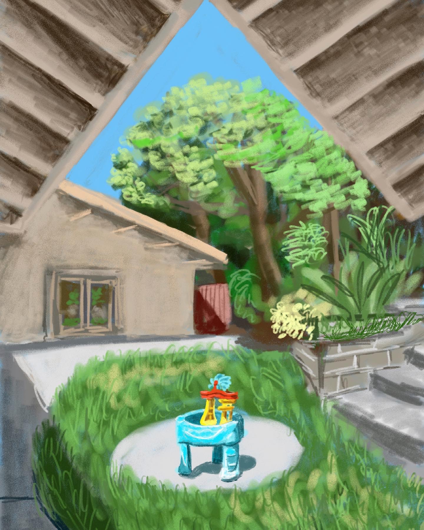
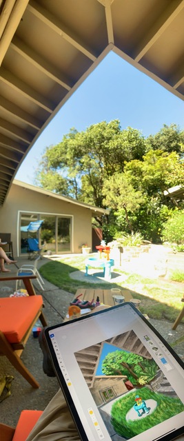
On the right is photo taken with the iPhone panorama mode. I rotated the camera in panorama mode, so the picture on the right includes different viewing directions. The eave over my head (on the top of the pictures) is shown as viewed from below, looking upward, whereas the lawn in the middle of the picture appears as viewed horizontally.
In the panorama, the changing view direction causes some straight lines to be curved. But this doesn’t happen in my drawing: in the drawing, the eave is a separate zone from the rest of the picture.
The ground plane in my picture also seems to have the same fronto-parallel depiction as compared to the photo.
There are numerous other differences in the sizes and slopes of objects between the two pictures, some of which may also reflect differences between perception and photography.
For the record, here’s a wide-angle linear perspective taken at the same time; it seems similar to the panorama in the regions it captures.
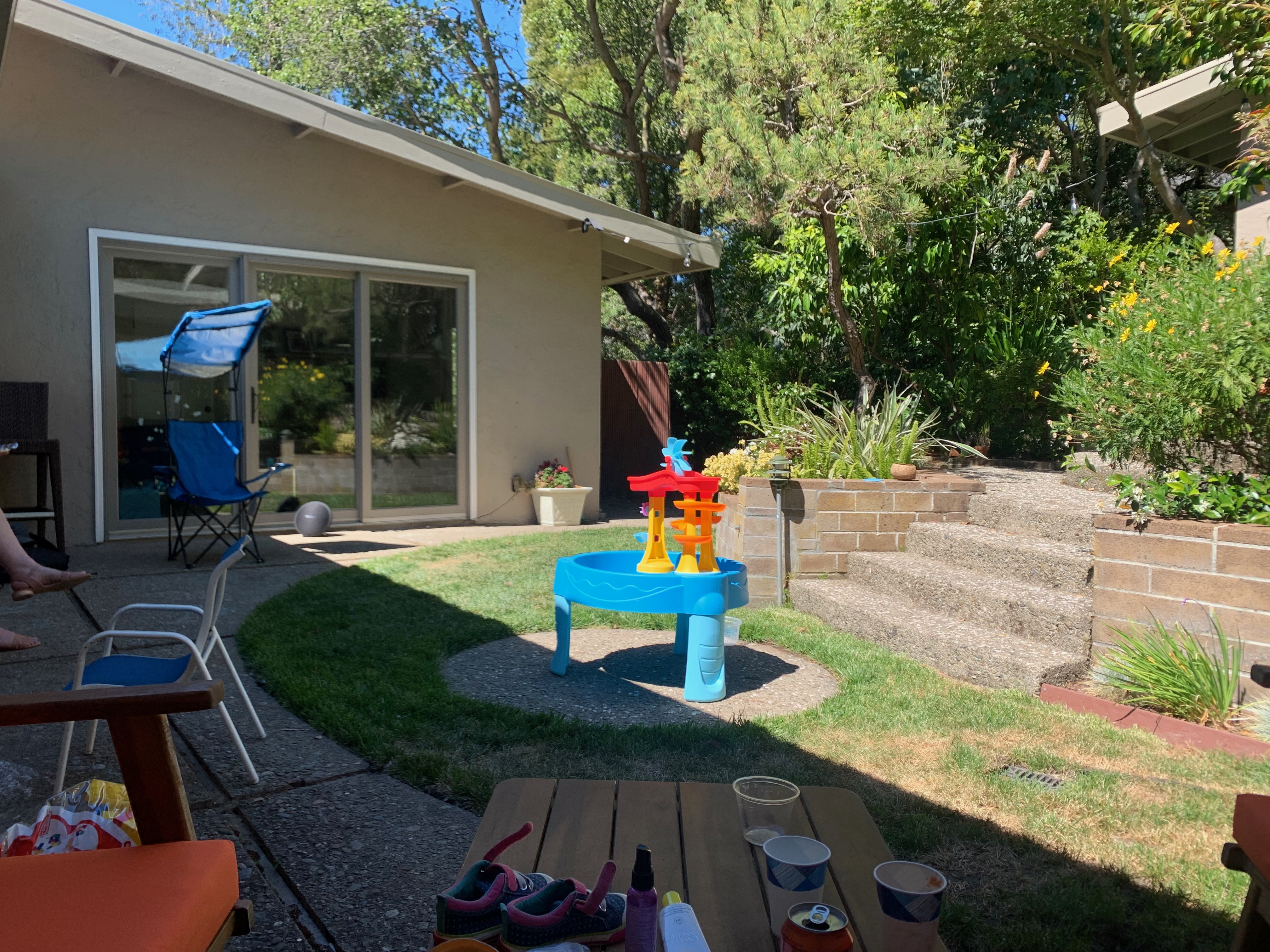
Here’s a more subtle example:
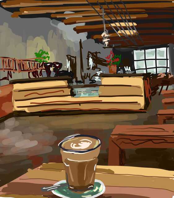
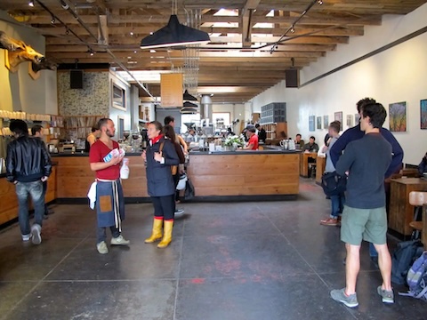
In this picture I see several zones/objects: the ceiling, the coffee bar in the middle of the picture, the windows in the back—each zone seems to be depicted with its own perspective that fits together into a coherent picture. Maybe I should go back to take a picture here to show how different the photo looks. Until then, here’s a photo I found online, looks like it was taken a few feet to the left:
One last drawing, that I made on a long car ride:
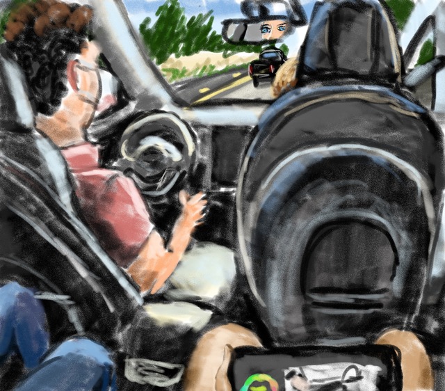
The backseat view is very wide-angle, and here I’ve squeezed a lot of stuff into a little space, arranging cartoon-like people and seats into a small picture. The view downward to my iPad on my knees is a different view direction from the view forward to the road.
Between theory and practice
Last year, I gave a talk on my perspective theories, and someone asked how these theories had changed how I draw. It’s an interesting question, and hard to know for sure.
Photographic correctness. First and foremost, I think that my earliest thoughts about perspective (and reading from Pepperell and Koenderink) freed me from notions of photographic correctness. I never believed there was a “right and wrong,” but still I found I had some latent belief in the rightness of photos, like any deviation from photography is an artistic choice. I’ve written about this previously.
Knowing the deviations of photography. Occasionally I do draw pictures based on photos that I’d taken previously. For example, I took a photo on a beach, and then came home and painted this picture from the photo:
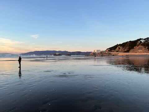
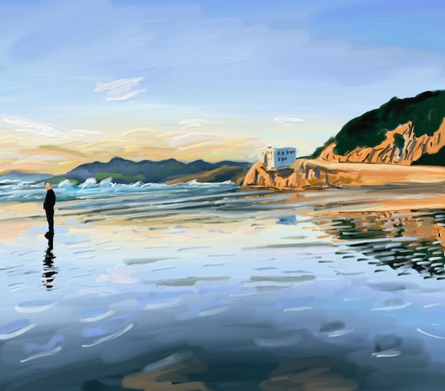
While I couldn’t remember exactly what I’d seen on the beach (due to the fragmentary nature of vision), I knew from experience that the building in the distance would have seemed bigger than in the photo. I knew that, had I been able to do the painting while standing on the beach, I would have painted the building larger. And so it made the decision very easy and natural to make it bigger in the painting too.
In a sense, making it bigger seemed more “perceptually correct,” even though I still don’t believe in correctness.
Thinking of composition as multiperspective arrangement. As I’ve mentioned throughout this blog post, I now think of painting as multiperspective arrangement. I often consciously thinking about moving things in pictures left or right or bigger or smaller as a choice for making the picture better. Maybe I was always doing it, but now it’s much more of a conscious set of choices, made more permissible by theoretical foundations.
Thanks to Alyosha Efros for comments.