Distortion and Multiperspective in Art and Photography
When do pictures look distorted, and what can we do about it? I’m not talking about “optical distortion”—flaws in lens optics—I’m talking about the perception of distortion. We seem to have a sense of when an object “looks right” or “wrong.” For example, here’s a photo I took with my smartphone:
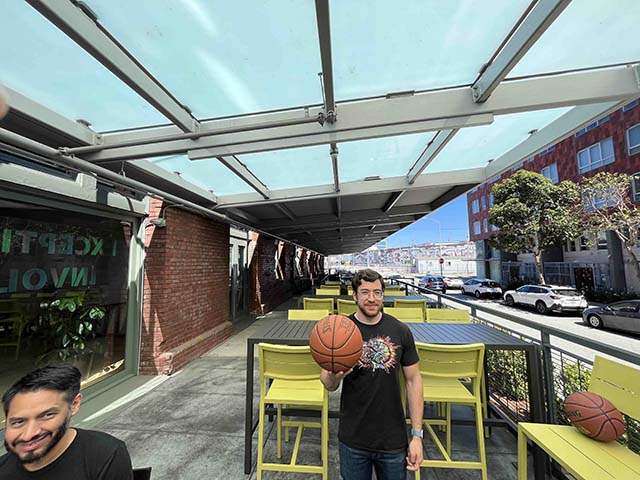
The basketball and the man’s face in the corners of the image appear distorted; their shapes “look wrong.” If you didn’t know what a basketball looks like, you might think the object in the lower right corner is actually oblong, not spherical. But, if you know what a basketball looks like, you can recognize that the lower-right of the picture contains a distorted basketball.
These distortions are caused by linear perspective, the Renaissance projection technique now employed by most of our cameras. In a previous blog post, I surveyed many of the ways our cameras make things look distorted because they use linear perspective.
In this blog post, I describe when distortion does and does not occur in pictures, including examples from art and multiperpective photography. Artists and scientists have long struggled to explain what’s going on with distortion, and with perspective in general. So many of these theories have been limited by the idea that linear perspective is the “correct” way to make pictures, or, perhaps, they’re limited by not having a suitable alternative.
This blog post won’t attempt to explain why human vision works this way—that’ll be in a future blog post (or you can read the paper now). Before explaining why, I first need to explain how it works. So, if you find yourself skeptical of this first blog post, know that this is only part of the story, to be continued in the next.
I believe the ideas that I describe here (and in the next blog post) can go along way toward resolving questions that people have struggled with for centuries. And, they could be helpful in designing new photographic techniques.
My goal here is only to describe how shapes are perceived by human vision—shape distortions, on their own, are neither good nor bad. Shape distortions appear in all kinds of art and photography. They’re often intentional, an integral part of a painter or photographer’s style. In Munch’s famous Scream, the distorted shape is integral to the artwork, not a failure of accurate depiction.
This blog post is adapted from two sections of this paper:
| A. Hertzmann. Toward a Theory of Perspective Perception in Pictures. Journal of Vision. April 2024, 24(4). [Paper] [Webpage] |
The Direct View Condition
In this blog post, I focus solely on when parts of a picture look distorted: when do things “look right” or “look wrong.” This post is not about whether they’re accurate to life, and not about optical distortion.
If you look back at the photograph above, you might notice that things look reasonable around the center of the photo, and distorted in the corners. Based on this intuition, I claim that:
if objects look like they could appear at the center of a linear perspective picture (which a normal-angle focal length), then they don’t look distorted. Otherwise, they look distorted.
This rule is called the Direct View Condition, and I’ll write it as “DVC” for short.
This is a general rule for any part of a picture. But, it’s easiest to explain the DVC rule by giving examples.
At the center of perspective pictures, faces appear symmetric in 2D (not oblong or skewed), and spheres look circular, so the DVC says they should be too:

But, when they’re stretched, or otherwise not symmetrical like in this picture, they look distorted:
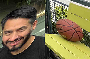
Straight lines always look straight in linear perspective pictures, so the DVC says that straight lines should be straight to not look distorted:
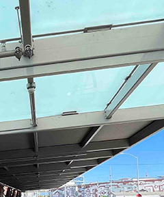
and if a line curves—or the edge of a building, or another straight object curves—then it looks distorted
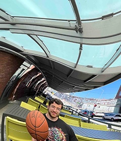
These rules match how things look in real life: faces are symmetric, straight lines are straight, spheres are circular.
In short, the DVC says that, if you want to determine if some part of a picture looks distorted, then cut out that part of the picture, and ask “does it look like it could have been at the center of a photograph?” And the answer tells you if that part looks distorted.
The DVC can apply to any part of the picture, not just objects, but I’ve explained it that way to make the explanation simpler.
Indeed, in David Hockney’s book Secret Knowledge, he talks about classical paintings can be broken up into pieces, each of which is itself like a little picture.
The DVC does not say anything about how the picture was actually made, only how the picture looks. It says nothing about how the picture relates to any actual object that was photographed or drawn. A painting can look realistic or distorted even if the contents were entirely made-up and do not refer to any real scene.
Examples
You can take a picture of an unusual object and have it look distorted. For example, this looks like a distorted picture of a sculpture, but, if you look closely, you can see that the sculpture actually has that shape:

If we just cropped out the sculpture, then the apparent distortion is stronger:
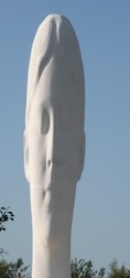
especially to anyone unfamiliar with the sculpture.
Here’s a very nonlinear projection of Paris:
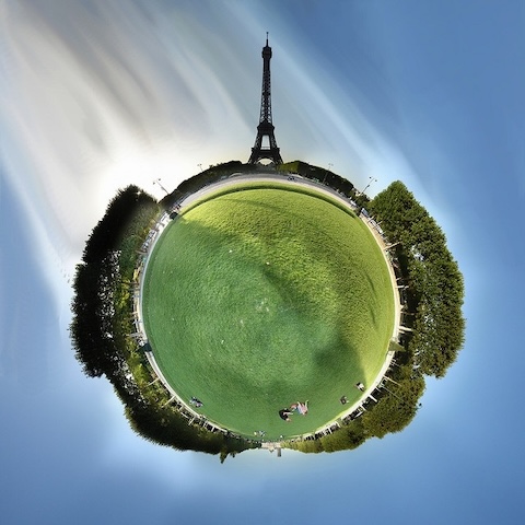
Most of it looks very distorted—the Earth doesn’t curve like that. (This is called a stereographic projection, specifically the “Little Planet” effect). But there are some parts that we can isolate that look fine on their own:

The Eiffel Tower here does not look distorted—it looks like it could have come from a normal, linear perspective photograph. Perhaps it actually is distorted in some way, with incorrect proportions, but that’s irrelevant to anyone looking at it (unless they know those proportions well), and the DVC is about how objects appear, not how they actually are.
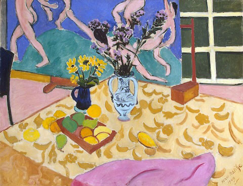
In this Matisse painting, none of the individual objects on the table look distorted, even though they are not foreshortened to match the slant of the table:
Similarly, none of the faces are particularly distorted, even though the scene perspective is not linear perspective:
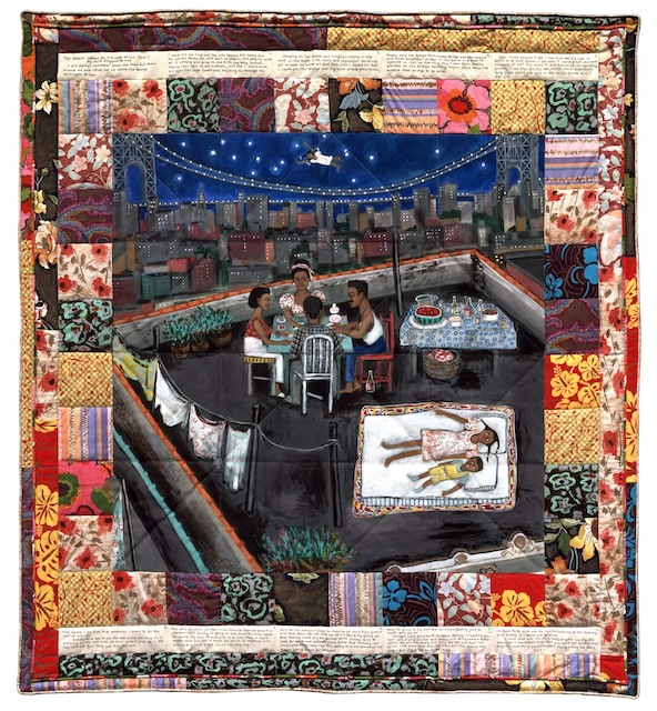
This scene can be broken up in to several different parts, which seem to each be depicted according to their own perspectives, e.g., the buffet table on the right seems to recede according to one-point perspective, whereas the girls on the mattress are viewed as if from above.
Here’s a 12th-Century Chinese painting, which uses parallel projection

The people are drawn like people in a linear projection, i.e., symmetric and not stretched or curved:

But the corner of the building, which represents a right angle, can’t quite appear like this in linear perspective, so it looks slightly off.
Multiperspective photography: wide-angle pictures without distortion
One use of this idea is to create very wide-angle pictures that avoid distortion. These examples support the correctness of the DVC, while contradicting conventional theories of perspective perception.
Here’s Frédo Durand’s family holiday card from a few years ago:
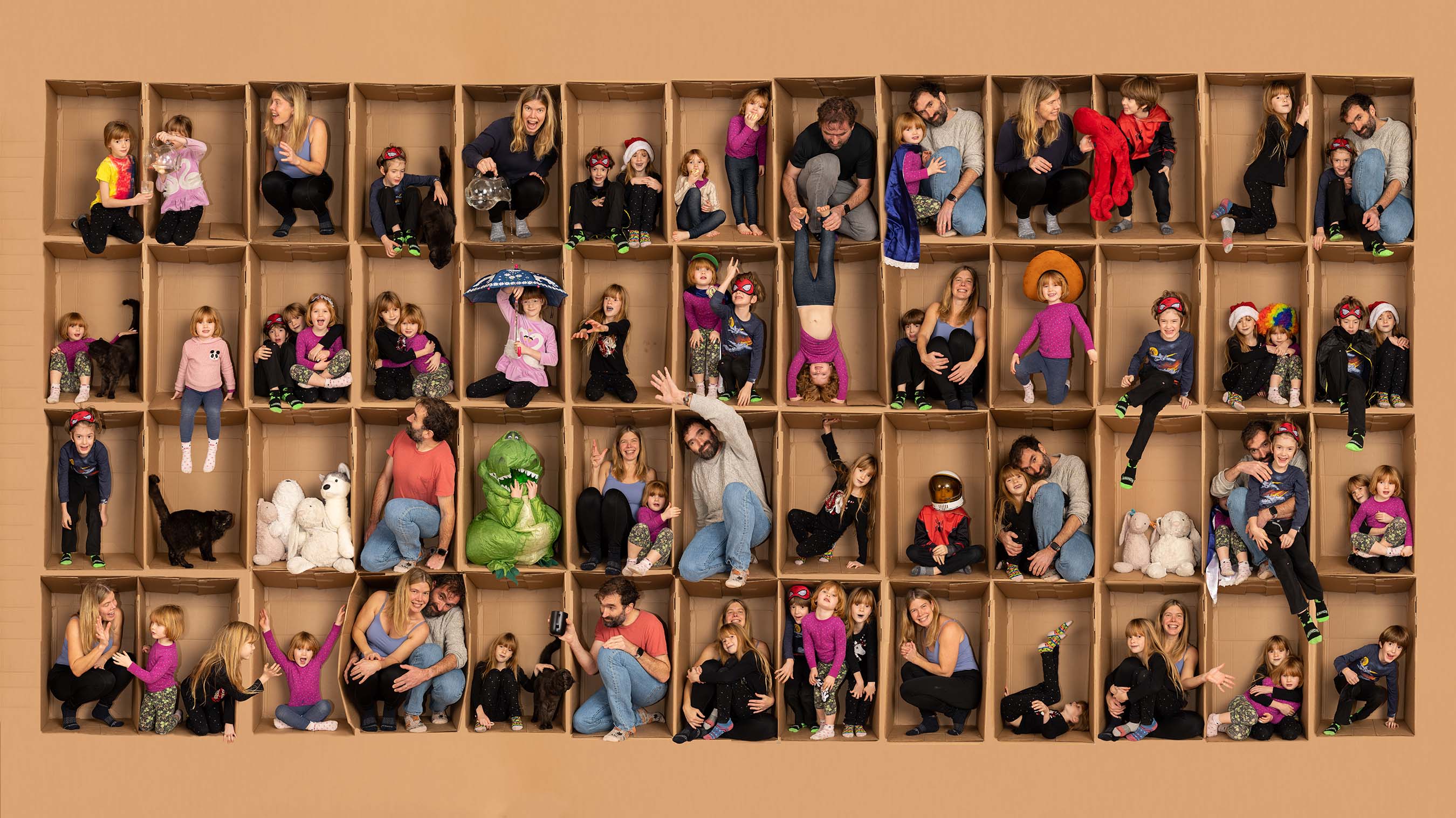
He created this by photographing his family in this cardboard box many times:
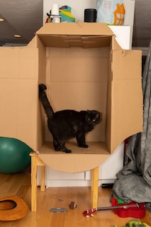
and then laboriously compositing the photos. [You can read more about his process here.(https://www.thecomputationalphotographer.net/2023/01/family-in-a-box/))
Notice that no part of the picture looks distorted: any square you cut out looks undistorted. Even if you cut out two boxes together it looks normal, although the walls between boxes look wedge-shaped. That’s because it’s a grid of linear perspectives, each with their own vanishing point.
This kind of technique can also be used to create views of street scenes, such as this panorama constructed by photographer Michael Koller in 2004:

There are some elements here that seem physically misleading—some buildings look trapezoidal, and there are multiple vanishing points. But otherwise it doesn’t look distorted, whereas a simliar wide-angle photograph of this street would be extremely distorted; it would require an extraordinarily wide angle.
Inspired by Koller’s work, several computational photography methods can create multiperspective street-view pictures, including Román et al. (2004) and Agarwala et al. (2006).
Multiperspective can also adjust perspective distortion. Changing focal length affects the appearance of faces and other objects:

(This is why I defined the Direct View Condition as requiring normal focal length: extreme focal lengths can make things look distorted.)
Pietro Perona demonstrated an intriguing way to photograph different parts of a picture to adjust for this. Here are two pictures of the same man:
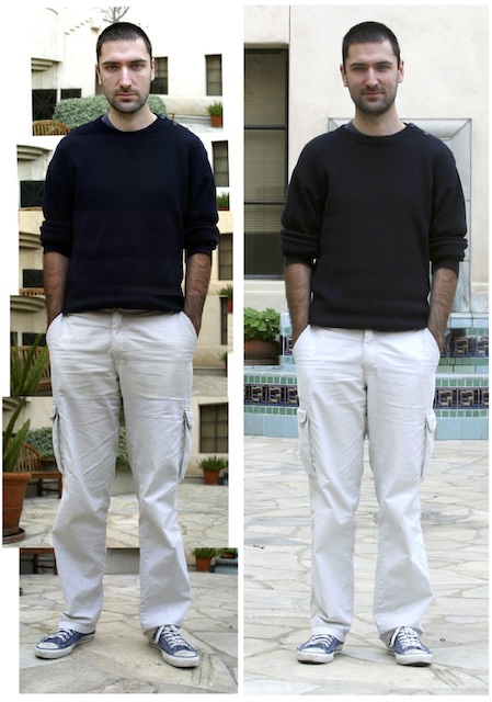
How does the man look different to you in the two pictures?
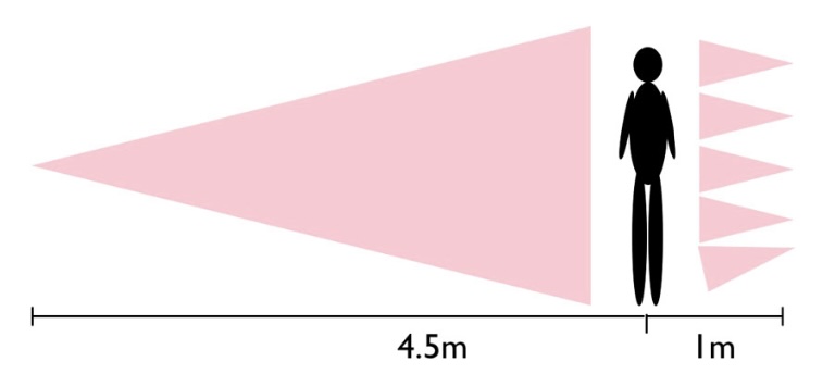
The right photo is a single wide-angle picture. The left picture is a composite of several close-up photos. It is not a single linear perspective photo, it is a composite of several. Pietro Perona argues that full-body Renaissance portraits are more like the picture on the left than the one on the right, an idea I’ll come back to shortly.
This diagram shows how the two pictures were taken:
So far, I’ve shown examples where projections are attached horizontally or vertically. But it can also be used in other ways. For example, Badki et al. (2017) describe a computational approach that combines different perspective projections for different depths, thereby bringing distant objects closer:
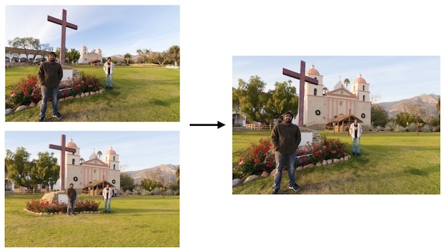
The two photos on the left are two of the input photos, and the photo on the right is the output, in which more-distant objects are photographed with more zoom than nearer objects. However, it just looks like a single, “normal” picture without distortion.
There is a large literature on computational photography algorithms for semi-automatic multiperspective. These algorithms illustrate that multiperspective isn’t just a few special cases, it’s a general strategy for making pictures. See my paper for a complete survey.
Classical painting is multiperspective
In school, we are often taught that classical painters used linear perspective—sometimes we’re taught that this is the “correct” way to make pictures. When linear perspective was invented in the Italian Renassiance, artists quickly adopted it as a technique for painting. Yet, artists quickly discovered the distortions it creates. Leonardo da Vinci, as he explored it more, began to distinguish between “artificial” linear perspective and “natural” perspective that more accurately depicts how things look. Since then, many famous artists throughout history have mastered linear perspective, discovered its shortcomings, and then taken different approaches to perspective.
I claim that multiperspective describes classical painting techniques better than conventional linear perspective. Classical painters do not use linear perspective consistently—instead, they use multiperspective techniques, so that their pictures do not look distorted, as can be determined by the DVC. We can tell this by looking at the faces.
Here’s Raphael’s famous The School of Athens:
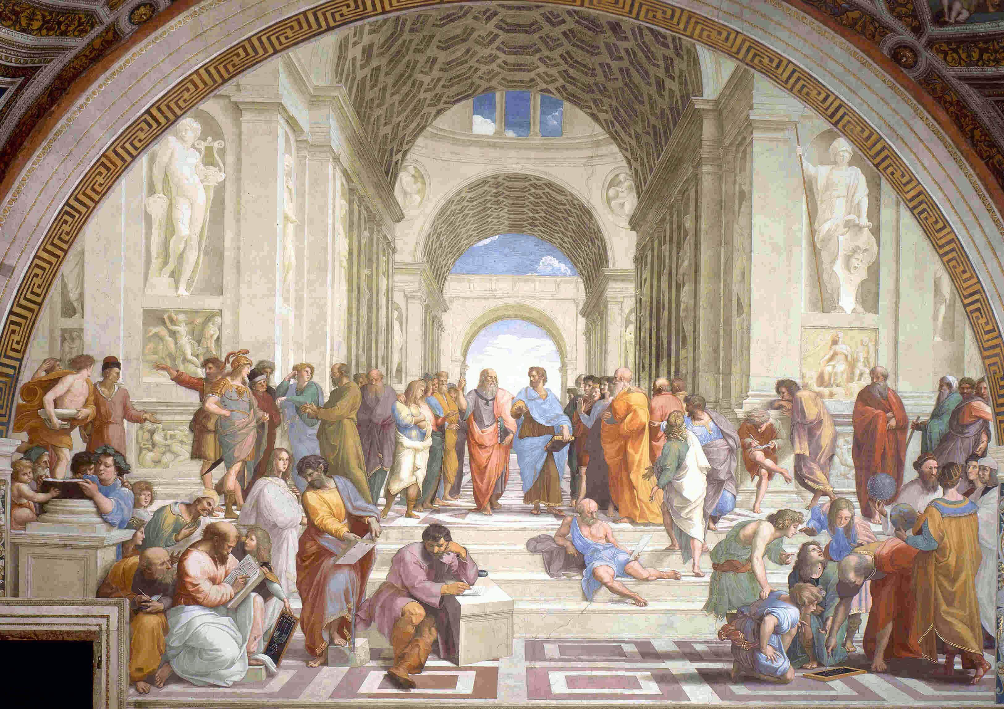
The architecture strictly follows one-point linear perspective. But, take a look at the lower-right corner:
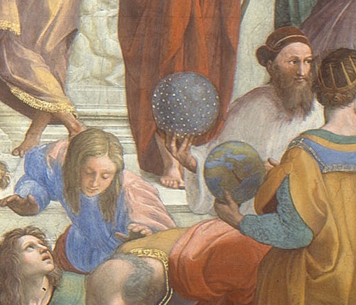
The faces and spheres do not have any of the marginal distortions that we see in linear perspective.
In all of art history, I have never seen a linear perspective picture that depicts faces with marginal distortion, even though there are many, many wide-angle pictures with faces in the margins. This illustrates how rare strict linear perpsective is in art history. In art history we have many of these large-scale scenes with many faces, without any faces (or other objects) appearing distorted:
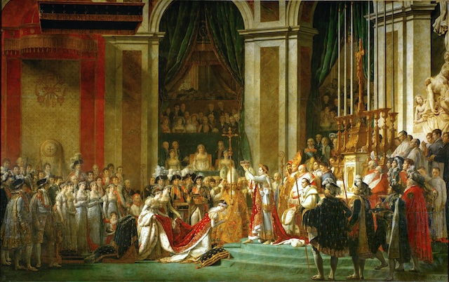
(What’s more, none of the art historians or perceptual psychologists I’ve read seem to have noticed this discrepancy—they sometimes even say that Raphael has perfectly followed linear perspective except for the spheres. Maybe it’s because they didn’t have smartphones.)
Art historian Martin Kemp surveyed the classical paintings in Oxford’s Ashmolean Museum, and found that only 3% of them strictly followed linear perspective construction rules. He told me that classical painters often used linear perspective to construct architecture like a stage set, and then moved the people around on it freely. Which leads into the next topic.
Making pictures
What does this tell us about the options available to artists to make pictures?
I find it useful to describe picture-making in terms of making choices, even though these choices are often not made consciously. I often don’t make them consciously when I draw. But, since I started thinking this way, I do find myself thinking about which objects to include or where to put them, in ways that I didn’t when I use to think of painting as just “painting what I see.”
In this way, realistic drawing and painting is being a bit like collage. As an artist, you can decide how to depict objects, and you can decide how to arrange them into a coherent composition.
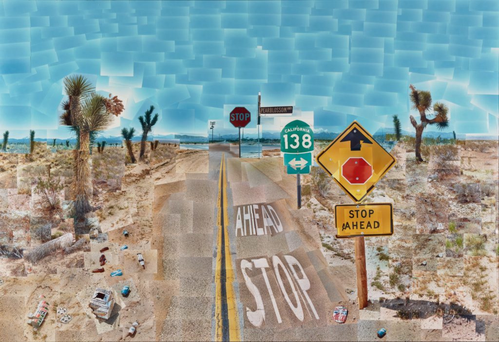
David Hockney’s Pearblossom Highway #2, which is composed of a collection of photographs collaged together, provides a nice metaphor for how we can combine different projections into interesting compositions:
Why Is It Like This?
There are a lot of gaps in my explanation, like “how big should DVC regions be?” This probably depends on the picture contents, the size of the picture and viewing distances—more research is needed.
Even so, I hope this blog post convinces you that the Direct View Condition and multiperspective projection provide a useful way to understand picture projections—maybe even better than the old ones we learn in school. The Direct View Condition explains when pictures do or do not look distorted, and multiperspective projection can explain how artists often work. These are general phenomena that should be explained by any theory of shape perception in pictures. And no existing theory explains them.
But maybe you’re still skeptical: why would pictures work this way? Why have linear perspective for parts of pictures, rather than the whole thing?
The answer has to do with properties of human vision, particularly foveal vision.
I’ll explain what I mean in a future blog post. (Or you can read the paper now.)
Thanks to Rif A. Saurus for comments.