Perspective Distortions: Why Normal Cameras Make Faces Look Weird
Have you ever noticed how peoples’ faces look stretched in group selfies?
For comparison, here’s a more-normal looking picture of the fellow in the lower-right:

It’s not a flaw in the camera or the lenses—they’re operating the way as designed.
These phenomena come from the use of linear perspective to make pictures. Linear perspective comes from the Italian Renaissance—and, for the 500 years since then, people have been using it to make pictures, and puzzling over the surprising effects it creates.
This post explains some of these stretched and misleading faces. The same principles apply to all kinds of shapes, not just faces though.
This post is based on two chapters of this paper:
| A. Hertzmann. Toward a Theory of Perspective Perception in Pictures. Journal of Vision. April 2024, 24(4). [Paper] [Webpage] |
Linear perspective
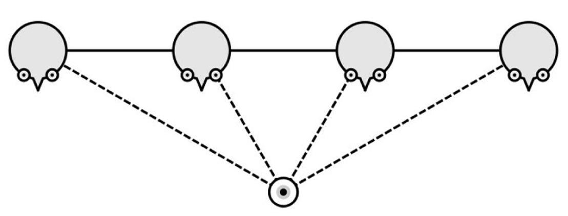
In the 15th century, Fillipo Brunelleschi and others came up with linear perspective, a technique for drawing pictures. Here’s a modern demonstration of drawing a picture with linear perspective, by placing down vanishing points (the push-pins), and drawing straight lines to the vanishing points:
Here’s a 16th-century diagram of the principles behind it:
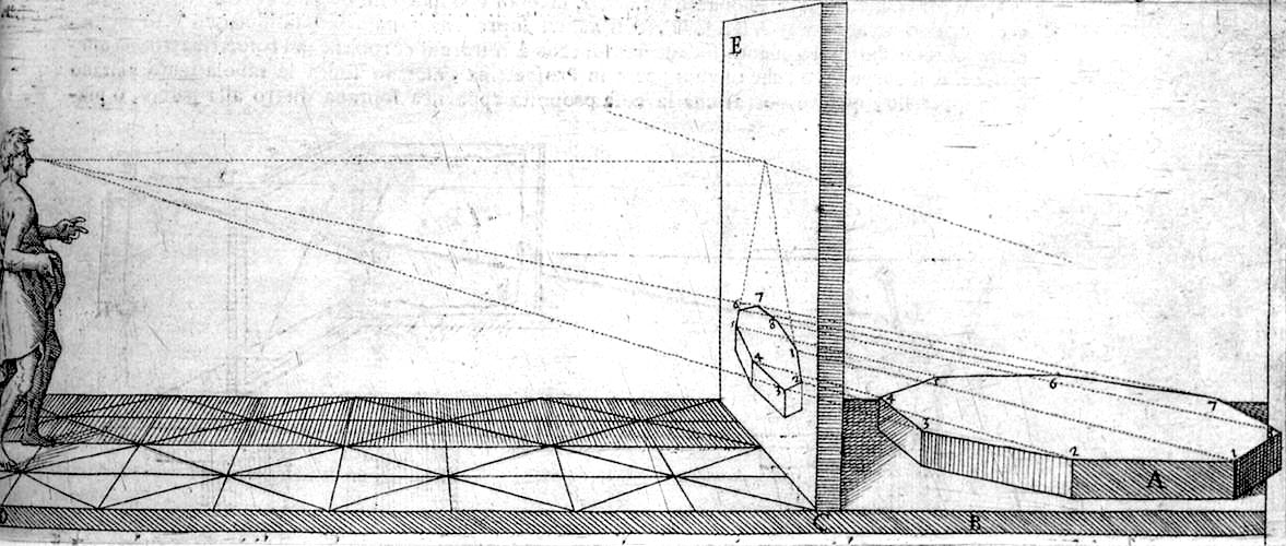
The idea of linear perspective is to draw, or measure, the light that hits the viewer’s eye, and intersecting the image plane. In the diagram above, the viewer should see the same thing whether they’re looking at the picture, or if you removed the picture and looked at the hexagonal object directly.
All the lines of light rays converge at a point called the center-of-projection (COP), or focal center. In this diagram, the COP is where the viewer’s eye is. The above illustration is a little unusual—normally the COP is in front of the middle of the picture.
Linear perspective became a foundational technique for making art, but also came to represent a philosophical ideal: art as a rational process, and a metaphor for rational scientific understanding in general. And, centuries later, many artists of the Modern Art movement rebelled against it, rejecting linear perspective as they rejected Enlightenment rationality.
Nonetheless, linear perspective—and its supposed rationality—dominate both our discussions of pictures, and our techniques for making them. Our smartphones and consumer cameras have all sorts of complex optics and fancy shooting modes, but, most of the time, most of us take pictures with cameras that mimic linear perspective.
I learned linear perspective drawing in a 9th-grade drafting class, I learned mathematical versions in my undergraduate computer graphics course, and then I taught it when I taught undergraduate computer graphics. Like many teachers, I taught linear perspective as though it were the “correct” or “default” way to think analytically about making pictures.
(To see why a sphere becomes stretched out like this in linear perspective requires working through the geometry. If you’re inclined to try it, trace out the shape of a sphere seen in the corner of a picture. Connecting the silhouette of a sphere to the COP produces a 3D cone that’s skewed toward the image corner. Intersecting this cone with the image plane produces an ellipse. One other surprising thing to notice: a flat disc that’s parallel to the image plane projects to a circle; the shape must have some depth variation to become distorted.)
Marginal Distortion
Modern cameras create linear perspective pictures, but they do it by measuring light rather than drawing lines.
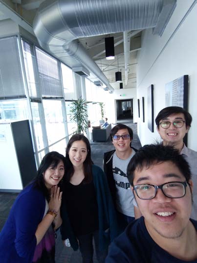
But linear perspective pictures can make things look distorted. Here’s a picture of two of my patient colleagues, taken with my iPhone in ultrawide (0.5x) mode:
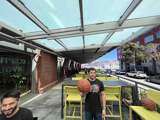
Notice how the face and the basketball at the center of the picture look normal, but the face and basketball in the corners look stretched. This is called marginal distortion. This is not a flaw of camera optics: marginal distortion occurs with perfect linear perspective.
I took this picture zoomed out (ultrawide), but the same marginal distortions happen in the smartphone’s default mode.
People have known about marginal distortions for ever since the Renaissance, and puzzled over them. How can it be that the “correct” way to make pictures does such weird things?
(By the way, the term “distortion” is often used to describe deviations from linear perspective, that is, “optical distortion.” I do not use it in the way here, as I am writing solely about how pictures are perceived.)
COP viewing
In principle, linear perspective requires you to have only one eye open, and to have it located right at the COP, in order for the picture to “look right.”
When Leonardo da Vinci first learned about linear perspective, he wrote that a picture will “look wrong” unless the spectator’s eye is “at the very distance and height and direction” where the artist’s eye had been.
Yet, pictures can “look right” from many different viewpoints. When you view the pictures on this page, or looking at pictures on your phone, you look from many different viewpoints, without taking care to put one eye in just the right spot.
Indeed, doing so would often be quite hard. Where do you even suppose that a picture’s COP is? Before I started studying this, I had no idea.
Here’s that picture again, with a magenta cross to show where the picture’s center is:

If you display the picture on a large monitor, and move a smartphone camera to the COP location, then it looks like this:
For this picture, the COP distance is 40% of the width of the picture. So if it appears 5 inches wide on your screen, then your eye should be 2 inches in front of the cross to view it from the COP. If you are reading this on a cell phone, then viewing from the COP is basically impossible because your eye would have to be too close to the screen to be able to see anything.
In short, viewing pictures the way you’re “supposed to” is actually very unusual, or sometimes even impossible, for these kinds of wide-angle pictures. And most of the pictures we look at these days are wide-angle. Smartphones take wide-angle photos by default.
You can try it yourself: display the picture on a large monitor, and locate the COP, which is in front of the magenta cross, at a distance equal to 40% of the picture’s width. Then place your smartphone’s camera there, and notice how the picture changes as you move your camera around.
You can then do it with your eyes. Put one eye where your smartphone camera was, and close the other eye. Again, the marginal distortion should go away.
But, there’s a surprise: if you open both eyes, then the marginal distortion reappears. The conventional wisdom says this shouldn’t happen.
(The exception are for viewers who are stereoblind, meaning that they do not have normal stereo vision. A stereoblind colleague told me that he does not notice a different with one eye open or with both. Roughly 10% of the population is stereoblind, and many people who are stereoblind do not even realize it.)
You don’t always notice it
We don’t always notice this effect, and it can make pictures misleading.
Here’s a wide-angle self-portrait by four psychology researchers:
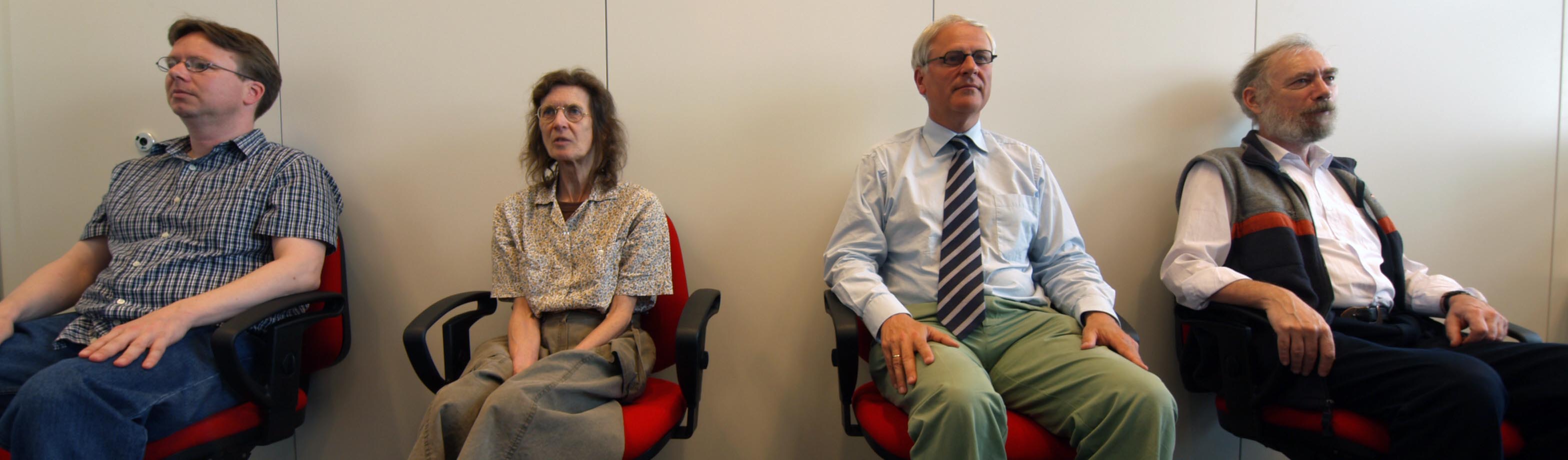
How are they facing with respect to each other? Are they parallel, or facing apart?
My first impression, when looking at the picture, is that they are facing apart from each other. However, they are actually parallel, in this configuration:
With a bit of thought, you can figure this out. Whenever I’ve shown this picture in technical talks, and asked the audience how the people are facing, someone always responds correctly that they’re parallel. But I don’t think it’s obvious.
Pixel correction
I plan to talk about techniques for removing distortion in a future blog post, but I’ll mention one here, because you might see it if you take ultrawide portraits on a Pixel or Samsung phone.
Here’s a picture taken by one of my colleagues, using a Google Pixel phone in ultrawide mode. His face appears in the corner, but it’s not distorted; why not?
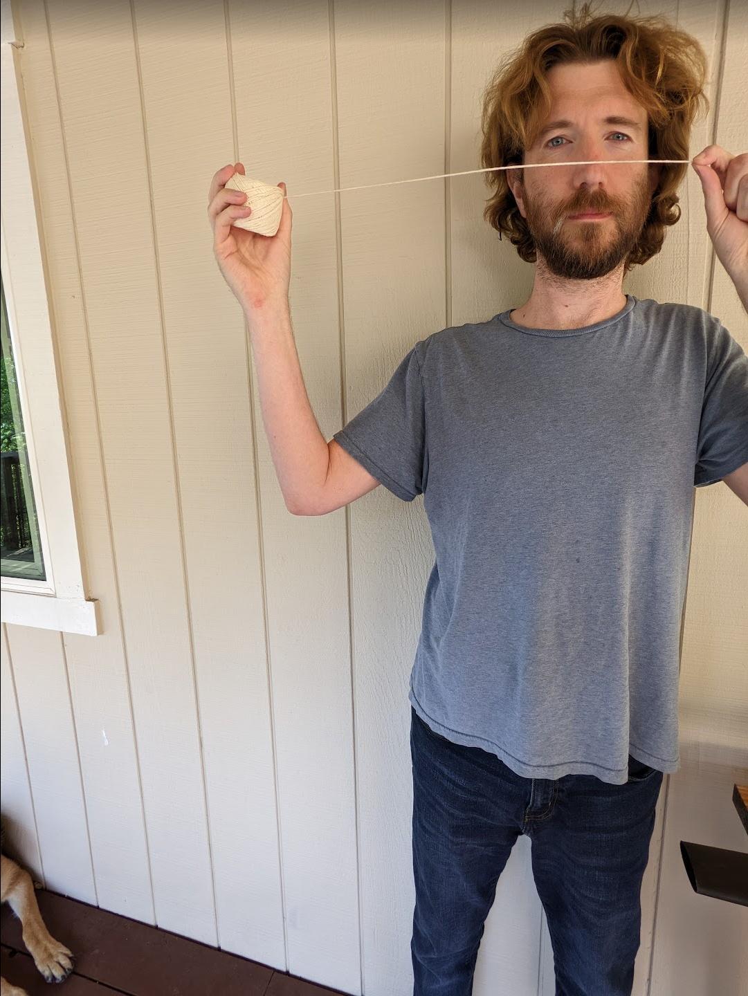
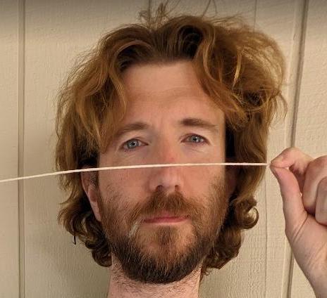
The reason is that the Google Pixel automatically applies a correction: it detects faces in the corners of ultrawide pictures, and applies a nonlinear projection for the face, which it blends with the rest of the picture. In this picture, notice how the straight lines (the string and the lines on the wall) have become bent as a result of this blending. Their technique extends a long line of previous distortion-correction techniques, but that’s a separate topic (which I may come back to in another blog post).
I’ve seen some evidence that Samsung phones all silently do a similar correction for faces, sometimes with rather poor results.
Perspective expansion and compression
Wide-angle pictures can create various other kinds of distortions. Here are two pictures of a dog that I took moments apart, with the same default iPhone camera settings:


In the left picture, the dog’s snout looks much larger than its body, whereas it doesn’t on the right. Yet, nothing changed, except that the camera is closer to the dog on the left. This effect is sometimes called, confusingly, “perspective distortion.”
This is why people take selfies at arms-length. Here are four photos of the same person:
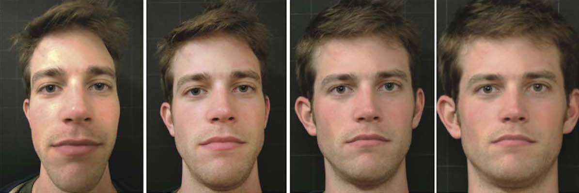
These were photographed from different distances, and zoomed-in accordingly. (This is sometimes called the “dolly-zoom effect,” first appearing in the movie Vertigo.). In fact, one psychology study found that photographing people from different distances could affect how attractive and trustworthy people appeared in the photos.
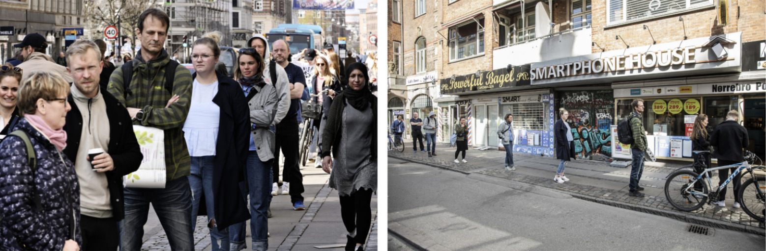
Conversely, telephoto photography goes the opposite direction, compressing objects next to each other. You may remember misleading pictures like this, early in the COVID pandemic, that made it look like people failing to obey social distancing rules:
Shifting from close-up to telephoto, while moving away from the subject, can create the dolly-zoom effect illustrated in this video.
What’s going on here?
There are two common explanations given for the distortions created by linear perspective. Both are compelling. But, I think, the first one is wrong, and the second is technically true but very misleading.
The first common explanation is that photography with a normal focal length (tehcnically, about 50 mm), “mimics human perception.” This is compelling but doesn’t make a whole lot of sense. Photographs don’t replace human vision—it’s not like pictures bypass your eyes, being directly downloaded into the middle of your brain.
Instead, photos are a bit more like “virtual reality:” putting something in front of your eyes to replace the real world. But there’s more to it than that. If pictures only worked like virtual reality, then we’d have to view them from the COP.
This leads to the second common explanation: the distortions occur because we’re not viewing pictures from the COP. It’s true that if we viewed pictures from the COP—with one eye open—we wouldn’t see these distortions. But this just isn’t how people look at pictures.
In fact, in a series of experiments, Cooper et al. showed that people tend to view pictures from comfortable viewing distances. We don’t get closer or further from pictures based on where the COP is. So, to me, this means that pictures should be made to work well based on where people view them. This often isn’t possible with strict linear perspective.
Throughout art history and perception research, there is a long history of assuming that linear perspective is the “right” way to make pictures, and any distortions or misperceptions must be “user error,” i.e., mistakes made by the artist or the brain. To me, this seems backwards. If human vision doesn’t perceive pictures according to the “rules” of linear perspective, then the “rules” aren’t quite right.
In my next blog post on this topic, I describe ways to make pictures that do much better than linear perspective at avoiding distortion.
Thanks to Andrew Adams, Elena Adams, Daniel Martin and Bryan Russell for help with example pictures.