How Does Perspective Work in Pictures?
Notes: portions of this blog post have been incorporated into a paper in Journal of Vision. I also have a new theory about perspective described here, although it doesn’t say much about the natural perspective topics on this page (yet).
“So the lens has been a dominant thing for six hundred years now, and I think depictions need to get away from that, really. If you do, marvellous things can happen.”—David Hockney, 2022
Have you ever had the experience of photographing something faraway, and, in the photo it looked far too small compared to its surroundings?
This blog post talks about why this phenomena happens, and what we can do about it.
I’ve always had the idea that linear perspective is the correct way to do perspective. In art courses I learned about two-point and three-point perspective and their development in the Renaissance; in computer graphics courses, I learned about the pinhole camera model, and how consumer cameras typically use lenses to approximate pinhole cameras. These methods of linear perspective are supposed to make it look like you’re looking through a window. If you put one eye at exactly the right spot in front of the images, then it would be like looking through a window, at least in terms of the geometry of the scene.
And, often in the culture of art and in computer graphics, when artists do something different than strictly follow the rules of linear perspective, they are “deviations from standard perspective.” Nonlinear perspectives—which use different rules for projecting 3D shapes to 2D—are considered an artistic choice, a form of creative expression, whereas linear perspective depicts “objective” reality. Photography makes persuasive illusions; people talk about photography as recording reality.
Making my own pictures led me down a road to understanding how wrong these views are. There is no such thing as correct perspective; all choices of perspective have advantages and disadvantages. It is impossible to accurately portray everything about 3D space in a 2D picture, so artists must make choices, and linear perspective is just one option.
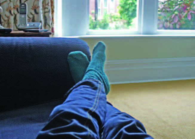
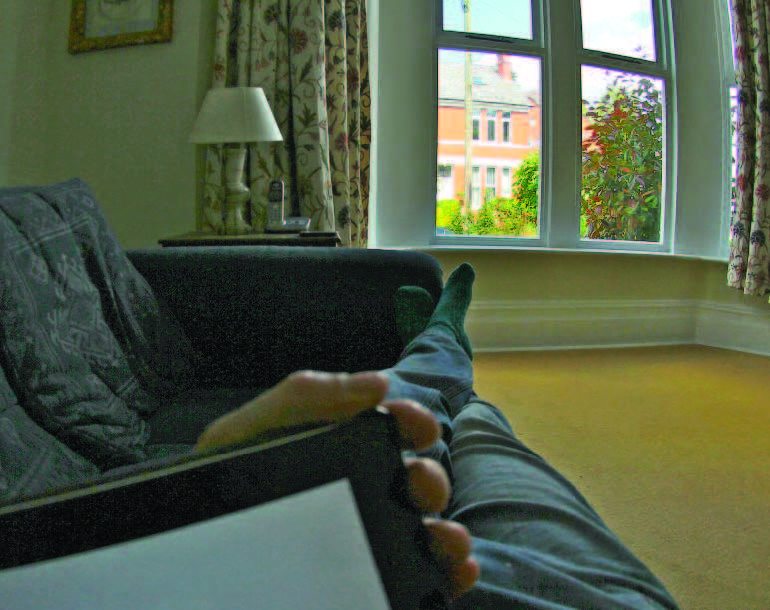
I began questioning perspective when comparing my paintings to photographs taken at the same time. This comparison often surprised me. For example, here’s a picture that I quickly sketched on a Winter day in Seattle:
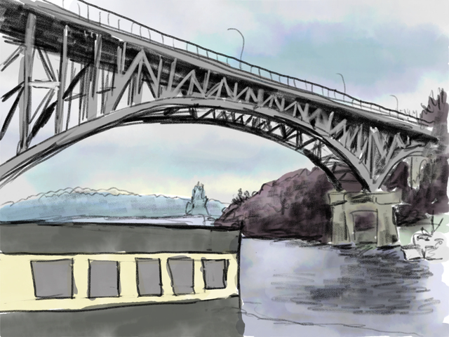
I thought it was a pretty good drawing of the Aurora Bridge. I also quickly snapped a photo at the same time, to have on hand in case I wanted to keep working on the picture later. Later, when I looked at the photo, the shapes looked really different:
Both the foreground building and the far bridge support appeared much larger in my drawing than they were in the photo, while many other objects vanished from the drawing.
My first reaction was to criticize the drawing. I didn’t do a good job making the bridge long enough, or drawing all the details in the canal.
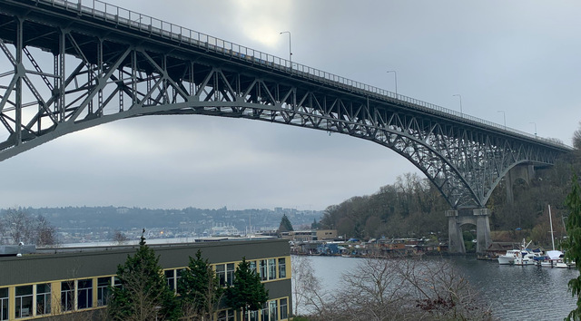
But then I also noticed that the camera tends to make distant objects look too small. While biking with a friend into a town called Esztergom, I marvelled at the enormous church on a hill towering over us. Yet, here’s how the photo I took then looked:

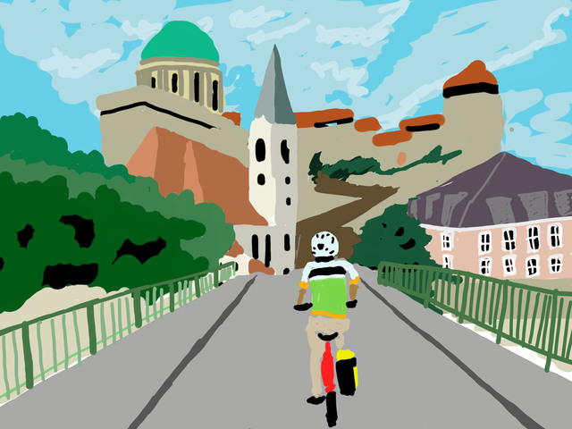
I later drew a picture from this photograph that better captured my memory of how big the church was:
Once I noticed this effect, I see it every time I take a wide shot of a large space: the objects far away look too small in the photo compared to how big they seem in real life. My drawings usually end up making those objects much bigger.
You can try this yourself. When you’re out in a large open space, looking at, say, a large building off in the distance, take a picture that captures the whole scene: not just the building but the streets near you. Does the building look as big in the photo as it does in real life? Most likely, the building seems like a small part of the photo instead of towering over the surroundings. Of course, you can zoom in, but then you have a picture of just the building and not the rest of the world around it.
The amazing thing to me is that, once I have the photo, my instinct is to accept the photo as objective reality. If the photo and my drawing disagree, it must be that the drawing is wrong. It’s only when I am physically in the space itself, comparing the photo and the real life experience that I see how much the photo differs from reality.
By the way, in the case of photographing the Moon, there are many theories around why the moon looks so small, e.g., refraction in the atmosphere, but, in photographs, I think this another instance of the same effect: in linear perspective, the faraway objects that we focus on look too small among their surroundings, and most of our day-to-day photography is based on linear perspective.
Natural Perspective
Had other people noticed this phenomenon? I recalled that Rob Pepperell had mentioned something like this when I met him earlier that year. Indeed, his papers described exactly the phenomenon I’d experienced.
Here’s a painting he made in an attempt to portray the experience of viewing the world at a particular location, with one eye fixed in a single direction:
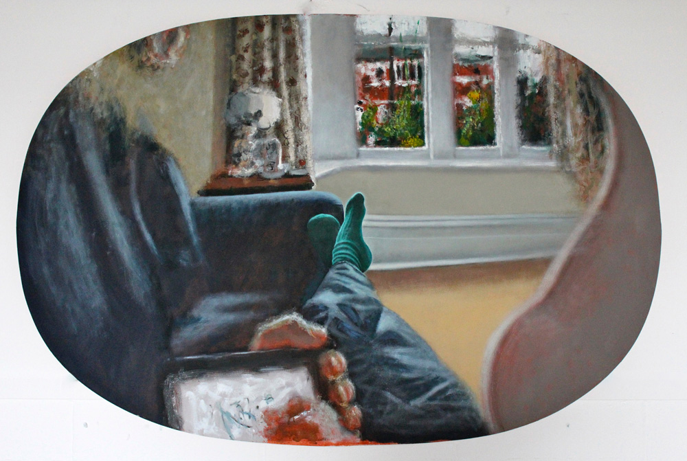
The main thing to notice here is that objects at the center of the image are largest. When you look at an object, it seems to dominate one’s perception, and it also somehow feels largest. (His image was inspired by a similar drawing by the 19th-century philosopher Ernst Mach.)
In contrast, compare to these two photographs that Rob took, one showing a zoom in on his feet, and one a wide-angle shot. The zoomed-in view doesn’t include any of the visual context on the sides, whereas the wide-angle view makes his feet much smaller:
There seems like something of a paradox here. On one hand, we don’t perceive the object at the center of our view to be physically larger than when it is in peripheral vision. Yet, somehow, in a drawing it should be larger than the objects around it. It is tempting to relate this to the fact that we have many more visual receptors in the center of our vision. It is as if we are aware of so much more detail in the center of our vision, and somehow we expect pictures to capture this.
In subsequent papers, Rob and his collaborators showed how common this kind of expansion is. For example, here’s Turner’s High Street, Oxford and a photograph from the same spot, taken 200 years later:
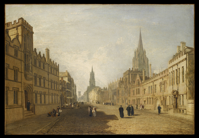
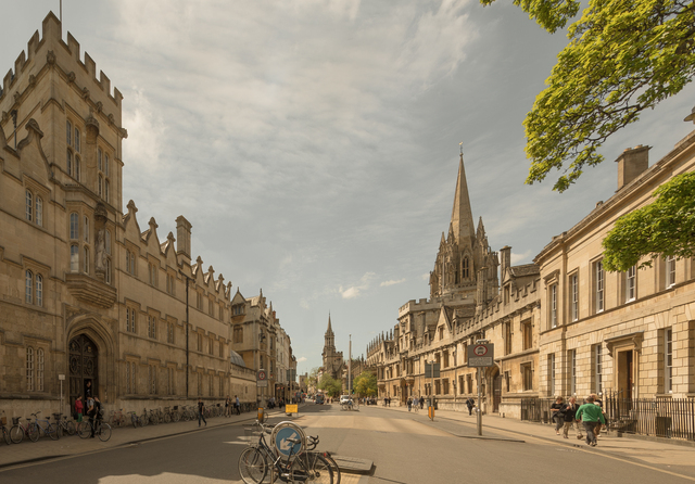
Note how much bigger the towers appear in the painting. (The photo has been digitally stitched from a few photos, and warped, to better match Turner’s viewpoint).
Rob and his colleague Alistair Burleigh developed a technique that simulates this expansion, which they call “Natural Perspective.” Natural Perspective seems to me like it could better capture what it’s like to experience a scene, as long as you’re looking at the center. They have further developed it as a 3D renderer.
But Natural Perspective is not “correct” perspective. Like all perspective systems, it has advantages and disadvantages. Natural Perspective has its own disadvantages. For example, the picture looks distorted: lines that should be straight are curved, whereas linear perspective preserves straight lines.
What if there is no true perspective?
But the paper that really transformed my understanding of perspective is “On Right and Wrong Drawings”, with Jan Koenderink as first author. Like many of Koenderink’s papers, I found it baffling when I first tried to read it, and then eye-opening when I came back to it later.
This paper points out that artists almost never use “correct” linear perspective, using examples from Rob’s previous papers: “Initial enthusiasm among fifteenth century Italian artists for the newly published methods was soon tempered by the realization that ad hoc modifications were required to avoid perceptual oddities.” They point to the 19th-century greats Turner and Constable, who were both proficient in perspective–Turner was a Professor of Perspective–yet neither obeyed linear perspective in their landscapes, and Turner spoke in detail about the problems with linear perspective.
Across art history, artists have developed a wide variety of approaches to perspective, from orthographic-like projections in ancient tapestries and hieroglyphics, to more discontinuous perspective in some Chinese scroll paintings, to more freeform perspectives in some modern and contemporary art; Hockney is a vocal proponent of them.
Second, they point out that viewers almost always view pictures from the “wrong” location. A cornerstone of linear perspective is the idea that the viewer must be at the focal center of the image to view it correctly. If you view a linear perspective image from the focal center, it should be like looking through a window—indeed, Leonardo da Vinci wrote that linear perspective images only work from the focal center. Yet, in reality we don’t do this. Most of the photos we look at would have to be viewed with one’s eye a few inches from the page. People in art galleries walk all around and view paintings from all sorts of angles. Hence, the whole idea of linear perspective falls apart. (Many perception researchers have claimed that viewers mentally correct when viewing a photograph from the “wrong” position, but I don’t find the arguments convincing for reasons I won’t go into here.)
Finally, Koenderink point out that choosing a projection amounts to choosing from among a number of different goals and constraints. The discuss parametric alternatives, focusing on stereographic projection from Helmholtz; in my opinion, this is the weakest part of the paper, because they were apparently unaware of more advanced work on this topic in computer graphics and computer vision research, which I’ll describe at the end of this post.
But there are some rules
There are so many ways to make pictures, and none of them is the single “correct” way.
Yet, we are still sensitive to how perspective works. Consider, for example, in early 2020, the misleading way that telephoto photography was used to make outdoor spaces look crowded and not socially-distanced..
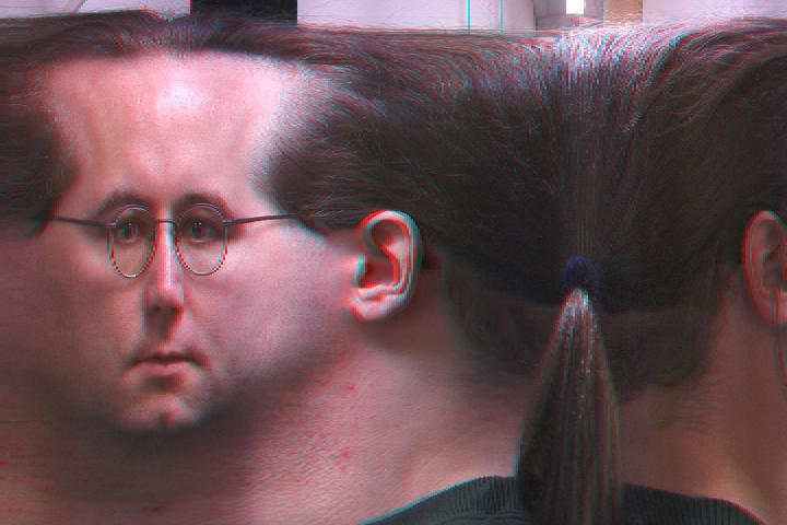
In fact, an insightful paper by Cooper et al. showed that, absent other cues, we tend to interpret photographs as if we are viewing them from the correct focal length. This makes photos taken from extreme focal lengths look distorted:

Here’s a sequence of photos of one person, taken by simultaneously increasing the focal length while moving away from the subject:
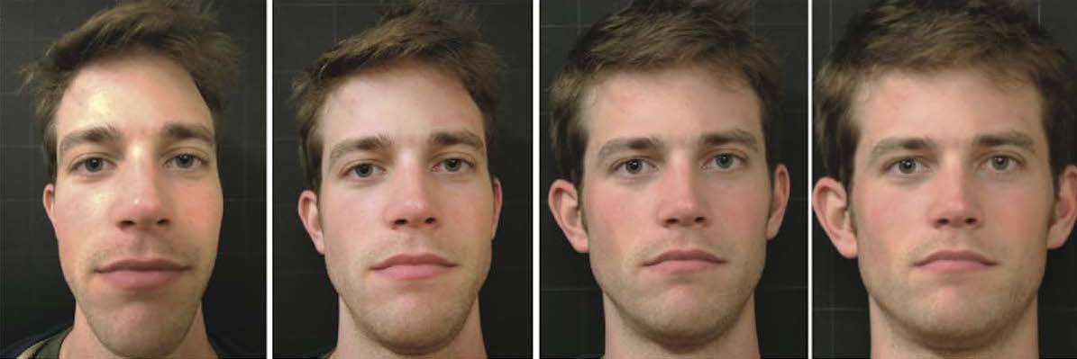
Unless you happen to know this person, this looks like four different people. The portrait taken from the “correct” focal length tends to look most appealing. One study showed that these differences affect how viewers perceive the personality of the subject being photographed: faces photographed from the closer distance appeared more “benevolent,” whereas those taken from a larger distance appeared more “impressive,” and intermediate-distance portraits appeared more attractive. There are software algorithms designed specifically to correct selfies for this purpose.
These observations mean that the perspective isn’t entirely freeform, with no rules. Artists can draw anything, but different drawings will give different impressions, and some drawings can be very misleading. The choice of perspective is a choice between trade-offs: for example, the desire to focus on some objects versus others, versus the goal of maintaining straight lines.
Computational photography for nonlinear perspective
Inspired by the different kinds of perspective systems in art, computer graphics and vision researchers have developed many kinds of nonlinear perspective. For me, the seminal (though not first) paper in this space is by Rob Carroll et al. This paper makes two important points. First, we needn’t find a single parametric projection, as previous authors had, but instead can treat perspective as an image warp. Second, because choosing a perspective projection entails trading off incompatible goals, the warp can be formulated as a nonlinear optimization. Here’s an example showing different wide-angle projections of a single room:
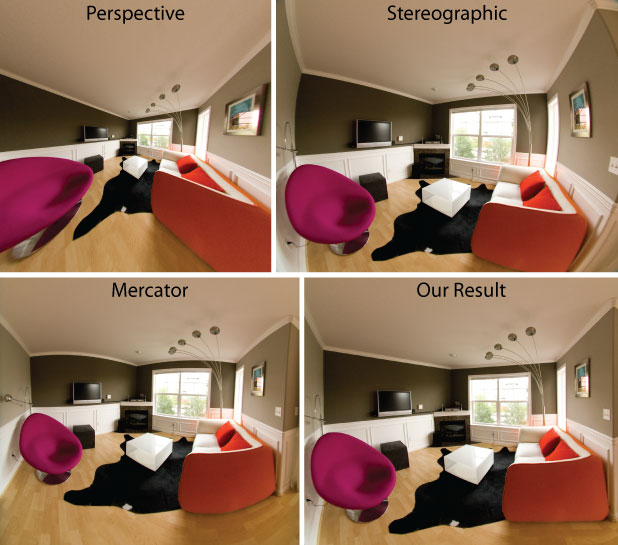
Notice how distorted the wide-angle linear perspective image is (upper left). The stereographic and Mercator images don’t preserve straight lines, whereas Carroll’s method has neither of these problems. A more recent method automates this for some cases.
Many other wonderful papers have introduced different types of artist-inspired nonlinear perspective, including methods inspired by full-length Renaissance portraits, cubism, de Chirico, David Hockney’s “joiners”, and many others. And many computational methods have no traditional analogue:
What about making distant objects look big enough, like in my Aurora Bridge drawing above? One approach that achieves this is Computational Zoom:
Computational Zoom has the disadvantage that it requires you to take several photographs from different positions, though, and the subject has to stand still while you take those photos.
In a new paper, led by Sean Liu, in collaboration with Maneesh Agrawala, Steve DiVerdi, and myself, we’ve developed a method called ZoomShop that works from a single photograph:
The bigger picture
Photography is not all-seeing in the sense that the eyes see. Our vision, a binocular one, is in a continuous state of flux, while the camera captures and fixes forever … a single, isolated, condition of the moment. Besides, we use lenses of various focal lengths to purposely exaggerate actual seeing, and we often “overcorrect” color for the same reason. In printing, we carry on our willful distortion of fact … —Edward Weston, 1932
Theories of perception and photography often tend to be all-or-nothing. Either linear perspective and cameras are correct, and cameras don’t lie. Or, there is no objective reality and everything is made-up. The reality is clearly far more complex. Our artwork employs all sorts of complex nonlinear structures, and our brains are able to understand and interpret them. Even more confusing, there’s some evidence that people with very different cultural backgrounds may vary in perspective perception in some cases. Understanding how and why perspective works is a hard problem (and one that I’m working on), as is developing new software tools to make images to easily convey what we want to convey.
I continue this theme in my next blog post, on light and dark.
Thanks to Rob Pepperell and Sean Liu for comments on this post, and to Taesung Park for pointing on the Oxford High Street example to me.