Why Dark and Light is Complicated in Photographs
Note: some of this post has been incorporated into a paper in Journal of Vision.
This post describes some of the choices involved in photographic tone reproduction, that is, how bright or dim each part of a photo is.
We may tend to think of photographs as just objectively recording light and displaying it. But this is not the case. Photographic tone reflects many choices made by the photographer and the camera manufacturer. Nowadays, our mobile phone photos are getting better and better, applying much more sophisticated—but hidden—aesthetic choices.
This, along with my previous post on perspective, are part of a broader theme of how paintings and photographs arise from artistic and technical choices. Photographs are not objective recordings of reality, nor are paintings direct depictions of the artist’s experience. I say more about this in the subsequent post.
Too much and too little light
Suppose you’re sitting in a dark room with a window open on a sunny day. If you used a light meter to measure the sunlight, the sensor would measure literally tens of thousands of times more energy coming from the sun than from light reflected in shadows. But we human viewers don’t generally perceive the sunlight as tens of thousands times brighter the way that a light meter would measure it.
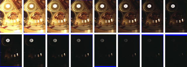
For example, here are two photographs taken with a film camera, inside Stanford’s Memorial Church on a sunny day:
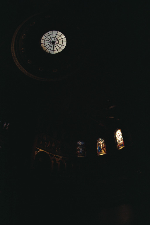
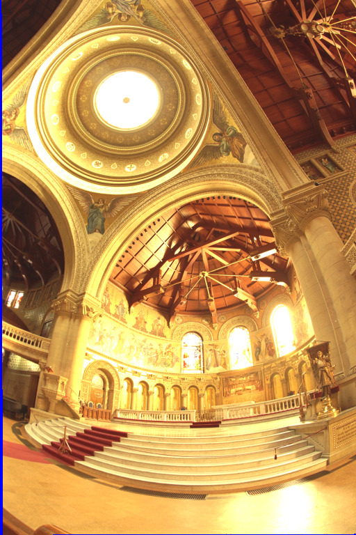
For the image on the right, the photographer kept the shutter open more than five hundred times longer for the left image than for the right image. So five hundred times as much light hit the film on the right. And still, notice how none of the details in the stained glass are visible on the right. This is because the light coming through the windows was roughly 24,000 times brighter than the light reflecting off the other surfaces. Camera film cannot record such a broad range of light intensities, so underexposed regions of the film became black, and overexposed regions became white.
We don’t normally see the world this way. Our eyes adapt to extreme ranges of sunlight using several mechanisms, including dilating our pupils when it’s darker out, as well as sophisticated image processing that happens in the brain (such as a process called contrast adaptation).
Whether using paintbrushes or digital displays, we cannot reproduce the extreme range of lightnesses we experience in the real world. This means artists and photographers must make choices about how to depict scenes with extreme lighting. Art and photography create compelling illusions of these kinds of experiences, but not by simply recording what they saw.
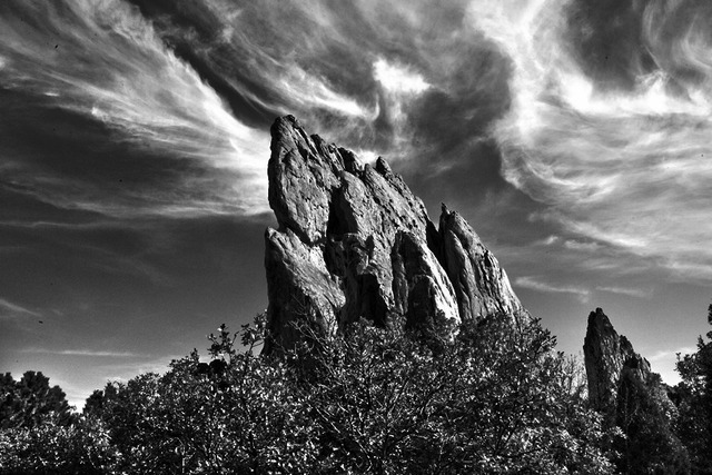
Painting the darkness
How have painters dealt with this problem? Here are a few examples.
One might think that conveying a nighttime scene is just a matter of making all pixels darker. But, in darkness, our vision adapts; and the experience of darkness is as much about the contrast between light and dark. Painters often emphasize this contrast without making the brightest parts of the painting any dimmer:
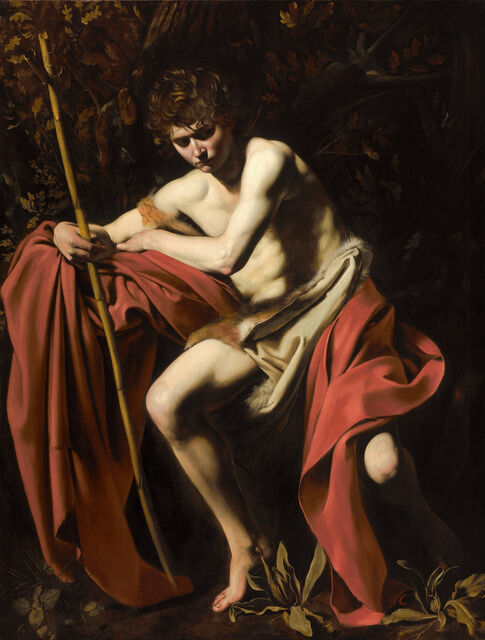
Rather than being illuminated everywhere, here the subject seems to be lit by an unknown spotlight (with religious connotations) at night. Lit regions are clearly visible, dark regions are nearly black, and the boundary between light and shadow is clearly delineated.
Later painters emphasized scientific rather than religious implications of illumination, making the light source evident (though obscured) in the scene:
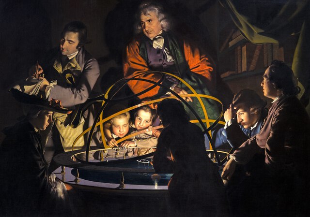
The location of illumination is different in these examples, reflecting the religious versus scientific difference between them, but neither makes the light source visible. The light source would need to be thousands of times brighter than anything else in the scene.
As painting edged toward Impressionism, painters began to depict the physiological experience of vision. In conditions of darkness, our vision is mostly blue-green. Whistler conveyed this experience in many of his nocturnes:
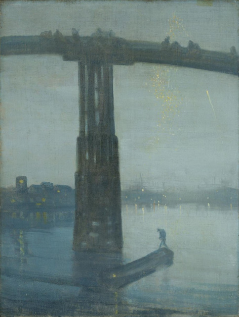
Such blue tints also appear, for example, in Van Gogh’s Starry Night and Starry Night Over the Rhône. Of course, many artists depicting nighttime scenes choose not to add this bluish tint to their images; this reflects just one possible artistic choice.
Film photography
For the first 150 years of photography, one of the photographer’s jobs was to control how much light reached the film. Photographers would adjust the exposure, aperture, and shutter speed. If they did these steps poorly, the photo would be underexposed, or overexposed, like the church pictures above.
The best photographs often came from careful enhancements in the darkroom, where photographers would laboriously add more or less light to different regions. Here’s a professional photograph:
and here is the original photo, along with the retouching notes from printer Pablo Inirio :
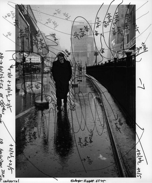
The photographer adjusted light and dark extensively, to highlight the subject, to create a much greater sense of contrast, and to enhance detail in the photograph. Such images reflect hours of darkroom labor, where the photographer would carefully expose parts of the negative more and other parts less, in a process called dodging and burning.
Ansel Adams was considered the master of such adjustments:
 A>
A>
See the dramatic variations in light and dark, the rich detail everywhere in the photo.
Consumer film photography
On the other hand, the average consumer photographer wouldn’t do these kinds of darkroom edits. For most people, you would choose your exposure settings, and this, together with the film that you put in your camera, determined the tones and colors that you got out.
This means that a lot of your options depended on choices made by the film and camera manufacturers.
My father, who worked at Kodak in the 1970s, tells me that Kodak engineers refined their formulas and processes by A/B testing. They would photograph professional models outdoors with different film variants, and then ask community volunteers which photos they liked better. The volunteers preferred images that made skin look pinker than in real life, and so this is what Kodak film did for a long time. This aesthetic choice was embedded in the film that millions of people shot pictures with.
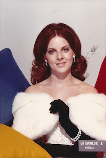
The models were chosen because they looked like “good, clean cut all-American young adults.” All of them were white. So, for many years, Kodak film worked poorly for black skin. Hence, this seemingly-neutral technology encoded racism.
It took a few decades for Kodak to include other skin tones. Eventually, Kodak created separate film processes for different regions of the world, based on their studies of regional preferences of film color.
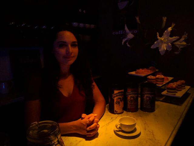
Day for Night
Movie and television filming often use a process called “Day for Night” to simulate nighttime. Because shooting at night is expensive, production often film by daylight but use various techniques to make the film look like it was shot at night, such as darkening the image, increasing the relative brightness of spotlights, and adding a blue tint.
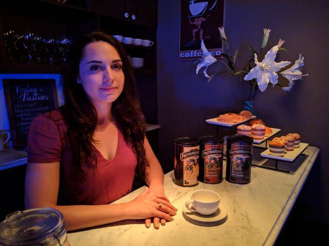
Here’s a picture of the coffee on my desk where I’m writing this:

If I just darken the photo, it just looks like a dark photo:

but with some very basic day-for-night techniques, it looks like this:

I did this quickly and sloppily: I merely darkened the shadows and gave the image a slightly bluish tint, using very basic image processing operations. It now looks more like a nighttime photo with a bright spotlight, and it just took me a moment to do this edit. With more effort (and photographing a scene with different lighting) an even more convincing nighttime image could be made.
Computational Image Enhancement
In the early 2000s, researchers created a new field called Computational Photography, exploring ways to use computation to replace or improve on traditional phographic techniques.
An important example is high-dynamic range photography. A 1997 paper by Paul Debevec and Jitendra Malik pointed out the indoor-lighting problem above, and showed that it could be fixed by digital techniques, combining information from multiple photographs with different exposures:
which could be computationally combined into a single “high-dynamic range” image and displayed:
These techniques came to be known as High-Dynamic Range photography. (A few obscure earlier papers also proposed similar ideas.)
This process actually involves a second step once the exposures are combined. When the brightest spots are 20,000 times brighter than the dimmer parts, how do we display these images on screens where brightnesses can only vary by a few hundred degrees? Techniques for this are called tone-mapping. Following the publication of the above paper, a flurry of methods for HDR capture and tone-mapping arose, with different ways to compress the light values into what can be displayed on a screen or printed on the page.
Many HDR techniques are based on enhancing image edges, so that every part of the image would have detail like in Ansel Adams’ photos. This kind of edge enhancement can be applied to a normal photo as well, and “HDR” itself became the name for a particular visual style, with artificially-enhanced detail and contrast between light and dark:
If you’ve ever looked at the photos in real-estate listings, you may have even noticed this “HDR look,” which, together with very-wide-angle perspectives, makes every house more spacious, warm, and sunlit than it actually is.
These kinds of ideas led to tools for artistic image enhancement. A 2006 paper by Soonmin Bae, Sylvain Paris and Frédo Durand showed a style transfer method that adapts gradient statistics from an example photograph to a target. Here’s an ordinary photograph, and the result of applying their method using the style of the Ansel Adams photo above:
Why Do These Things Look Real?
Why are there so many ways to display images that look good? It’s so difficult to paint things that look real, and hard to make special effects in movies look real. Yet, we can also do all sorts of cheap photo manipulations that look convincing.
Indeed, when these early tone-mapping algorithms were being developed, I thought there had to be some magic to which algorithms worked and which ones didn’t. Many of the original researchers working on tone-mapping focused on perceptual and physiological models, including the fact that human vision is more sensitive to edges than to absolute illumination. But I don’t think these models explain why these methods work, for the same reasons that I don’t think edge sensitivity explains line drawing—especially since simpler algorithms came along that seem to work as well or better.
Here’s a simpler explanation. When you edit an image, the new image looks real if it corresponds to a plausible real-world scene. For example, here’s what happens when I boost the brightness of that coffee by 50%:

This took me less than a minute, and I only applied a very basic image processing operations, namely, increasing the brightness of some pixels using Photoshop. At first glance, I don’t think the edit is noticeable; it looks like a real photo of a brighter coffeee cup. You can tell it’s fake by looking more closely, but mostly because of the sloppy matting.
Why does it look real? For the most part, the modified image could be a real photograph. Maybe the cup is lighter, or maybe there’s extra light on it from a reflection. Either way, our visual systems interpret the modified image as if it were real, rather than trying to detect the fakery. Indeed, we human viewers are not very sensitive to certain kinds of implausible illumination, which is sometimes a giveaway for image forgeries.
So, what happens in tone-mapping? When we measure light with a dynamic range of 10,000:1, for example, in a scene with both sunlight and indoor shadows, and then transform that to an image with a dynamic range of 250:1, the human vision system doesn’t perceive this as bright sunlight.
Tone-mapping does change the nature of the scene depicted. We perceive it as a scene with dimmer sunlight, where the light from the sun is thousands of times dimmer than normal. But we don’t read it as a celestial cataclysm because we know how photographs work. The experience is different from looking at the real scene, but the understanding is similar.
The same effect applies in line drawing, where line drawings look like real scenes under a very particular lighting and shading.
This means we can change images in lots of different ways and still have the image look good, even though the impression is subtly different.
Mobile Cameras and Machine Learning
Nowadays, pretty much every photo I take with my cellphone camera looks good, without any of the exposure and shutter choices that cameras once required. The phone is still making those choices, automatically selecting these parameters, or their analogues in our phones’ highly-miniaturized technology.
But our mobile cameras do much more than set exposures. They subtly adjust much of the tones and colors of our pictures. They operate like Ansel Adams locally adjusting tones in a photograph, and they do this silently and automatically for each photo. I can take a nice picture by pointing my camera straight at a sunset because of algorithms happening in the phone.
Around 2014, researchers at Google developed HDR+, which allowed Pixel phones to capture much more dynamic range than could be displayed on the screens. Hence, they designed tone-mapping to display these HDR images in aesthetically pleasing ways, including deep shadows like those of Caravaggio’s. The iPhone also had HDR capture since around 2010.
A 2017 paper by Michaël Gharbi et al. showed how real-time machine learning algorithms could replace hand-authored tone-mapping:
Based on training data from professional photo editors, their method used a carefully-engineered deep network to learn to apply these transformations to new images, in real-time on the camera. Their algorithm was designed with particular aesthetic goals in mind, such as preserving sharp edges. Such algorithms run regularly on our phones, such as Google’s HDR+, which combines multiple exposures similar to the church example above.
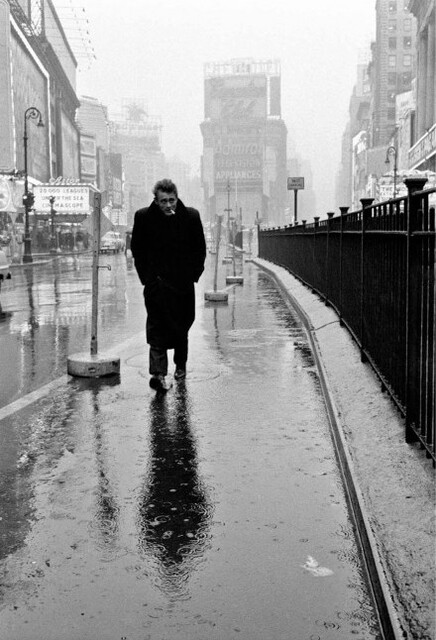
Perhaps the best place to see how photographic choices are embedded into mobile photography is Google’s Night Sight, used in Pixel phones. The algorithm encodes aesthetic decisions about what makes image look like a nighttime photograph, taking inspiration from painters like Joseph Wright of Darby, and shadow-darkening techniques like in “day for night” photography. Here’s an example:
Notice how, not only do they make the image brighter, they add contrast and bluish tints to parts of the image, while darkening shadows. I recommend reading the technical paper or the blog post for a fuller description of all the considerations involved.
The iPhone uses something similar; the nighttime photos on my iPhone got a whole lot better sometime after Night Sight came out on the Pixel. A week after I first posted this blog post, the New Yorker also weighed in with some details, along with complaints about aggressive photo corrections on the iPhone.
I love the way my phone takes amazing pictures of sunsets and nighttime skylines, and these pictures look so much better than those taken by my phone five years ago. My photos are a collaboration between me and the algorithm designers and camera manufacturers, and they reflect a combination of aesthetic decisions made by each of us.
(Update:) The year after I first wrote this blog post, I got to see Whistler’s Nocturne in person at the Tate Britain. Here’s a photo of it with my iPhone, on the left:
This photo is sharper, brighter, and warmer than the painting as I saw it with my own eyes: the iPhone has enhanced it by the same algorithm that it would have used to enhance a nighttime photo taken out on the Thames. The picture on the right (professionally photographed) is a much better representation of how the picture looked in real-life.
Read on about what all this says about more general themes in art and photography in my next blog post
Thanks to Andrew Adams, Paul Debevec, Michaël Gharbi and Peter Hertzmann for comments on this post.