Can You Tell If A Painting Came From A Photograph?
I sometimes play a game with myself where I try to tell whether a particular painting started from a photograph. Here are two paintings that recently hung across from each other in a co-op gallery in my neighborhood:
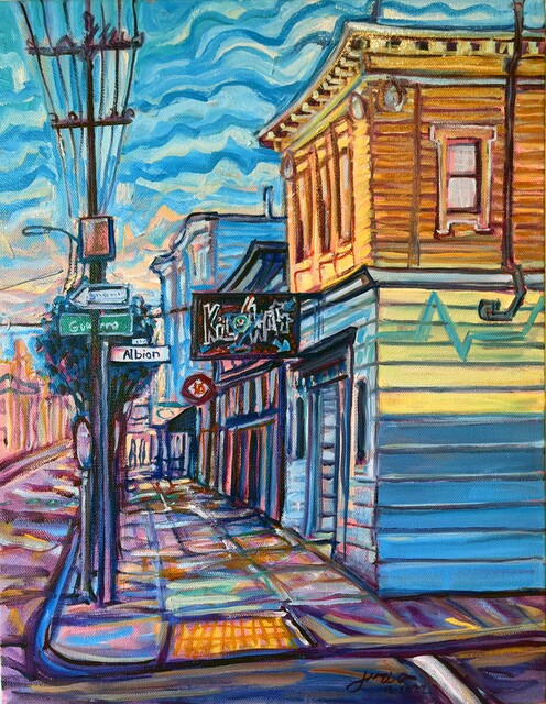
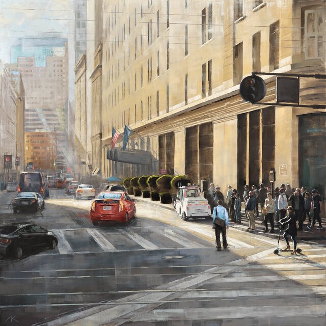
Was one or both of them painting en plein air (i.e., outdoors), working from a photograph, or some other way? How can you tell? Can you tell from the colors, shapes, and perspective alone, or does it require thinking about practicalities like changing light and people that don’t stand still? Or maybe it’s impossible to tell: each of them could have been painted in many different ways?
Here’s another collection from local artists; I believe I can tell some that came from photographs and some that did not.
The deeper questions involved
I care about this for several reasons. For one, I’ve frequently struggled with whether to draw my own pictures from life or from photographs. Is it cheating? Is is strictly worse? If so, why? Can you tell from the picture, or is it just a matter of pride?
Moreover, if it’s easy to tell how a picture was made, this indicates some fundamental differences between media—and possibly the unique capabilities of each. Is there some greater value in the skill of an artist who forgoes optical aids like photography? If, on the other hand, there’s no difference between these techniques, then an artist might as well pick whichever approach is easiest.
Motivated by these questions, this post reviews differences I see in my own pictures, made with and without photographs. Even if it’s specific to my own paintings—and I often can’t articulate what the difference is—I hope they can give a sense of how a painting from a photograph can look very distinctly different from one drawn from life.
I don’t normally like to share the accompanying photographs because I think they change the perception of my paintings, but I’ll make a few exceptions here. Even when I draw directly from life, I often take a picture for later reference or comparison.
Hockney’s Example, and Photorealist Painters
Reading Hockney’s Secret Knowledge spurred me to write down these thoughts; I wrote more about the book here. Hockney begins his story with his visit to an exhibition of Ingres’ drawings, such as this one (which I have cropped):
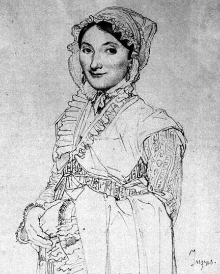
He points to the precision and swiftness of the lines that show no oversketching or adjustments, yet the form and details are precise and accurate. He compares it with other Ingres drawings, like these:
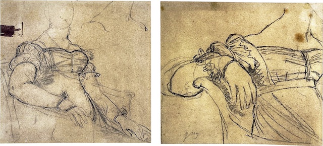
which show some of the effort to “find” the form. They seem more lively and less precise. He continues with many other arguments and examples, many of which focus on the precision and realism of paintings.
Making Pictures From Photography
Since I re-started painting and drawing in 2019, I spent a lot of time thinking about how and when to use photographs. Is it better to draw from life? If so, why? Is it “cheating” to use a photograph? How does drawing from a photograph look different from drawing from life?
The process of drawing from a photograph often feels very different from drawing from life. It sometimes feels like the difference must be obvious to anyone who looks at my pictures. But, looking back, I’m not so sure.
I started out with very simple rules and prescriptions for myself, and my views on each of these questions grew more nuanced as I progressed. I don’t think there’s any right or wrong way to do things, but drawing from life is really different from drawing from reference photograph, and both are worth experimenting with.
Initial experiments
Here’s the very first drawing I made on my iPad in 2019, sitting on my couch and trying out my Apple Pencil:
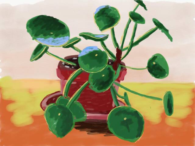
To me it doesn’t look remotely photographic, and, whether or not it’s any good, I believe there’s a lot of “liveliness” to it. It gives a sense of a person making a freehand sketch, you can almost imagine the hand movements—and there’s psychological evidence that people do imagine (in some way) the physical action of making the brush strokes when looking at a painting.
Later that year, I snapped a picture while biking, and later drew this picture from it:
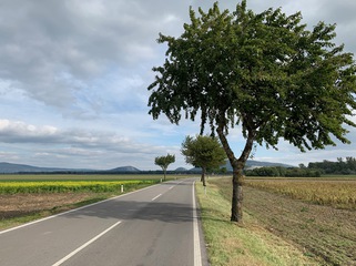
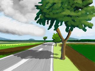
The result felt lifeless and dull. Like I was just copying elements from the picture, and it seemed to prove that just copying was pointless.
A few days after that, I took a picture of some streetcars that gave me the impression of having some “body language,” and I remembered that impression when drawing this picture from the photograph.
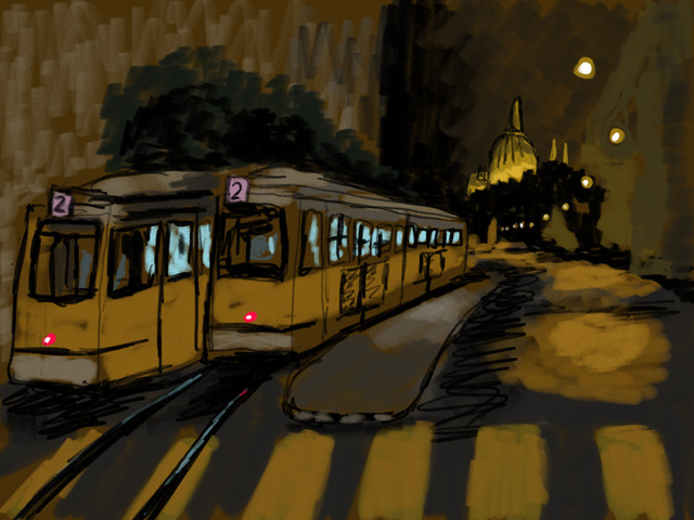
This felt more successful; I doubt anyone could tell it came from a photo.
The next, day, I painted this picture from a photograph snapped while boarding a plane:

To me, it seemed pretty obvious that this was drawn from a photograph. Apart from some aspects that look non-photographic, like the random clouds in the sky. I struggle to articulate exactly why it looks photographic. Too perfect? Wide-angle perspective distortion?
Here are two pictures drawn from life later in 2019. Do they feel like they came from photographs? They did not.
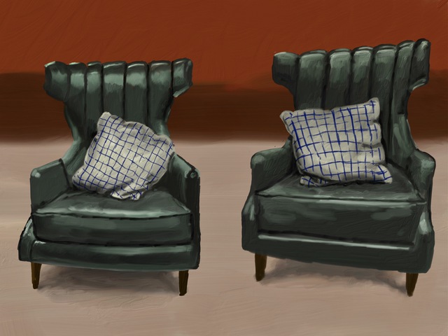
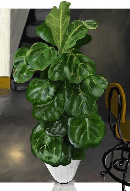
Here’s one from 2022, an African Horned Jelly Melon that I drew from life at home:
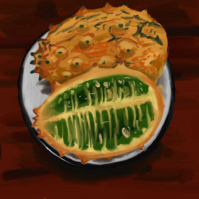
A friend commented on social media “At first glance, I thought this was a photo!”. She later said she’d viewed it on her phone screen; I think viewing them at small scale makes the illusion stronger. Here’s another one where a friend said they thought it was a photo at first; it was drawn from a photo.
Tracing
I never trace from photographs; I only use them as a reference on another screen while I draw freehand on my iPad. As an experiment I did once try tracing a photograph. But I gave up midway through, since the process and the picture felt so dull to me:
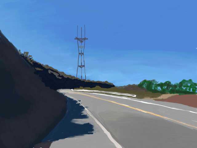
Looking back at it now, it doesn’t seem so much like a bad picture, but just a boring one—at least, boring to make. The picture isn’t much different from the photo. There’s no reason for me to draw like this.
Drawing from others’ photos
During the 2020 lockdown, I experimented with drawing from others’ portrait photographs: photos where I didn’t have any experience of the real scene, only the photo. I tried drawing from selfies on a social portrait-drawing app called Sktchy, but found my drawings unsatisfying. Here are two lockdown portraits from a others’ photographs that I found more satisfying:
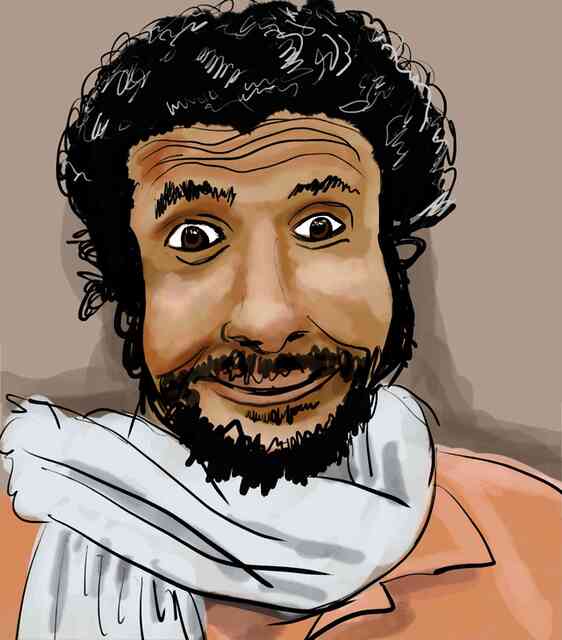
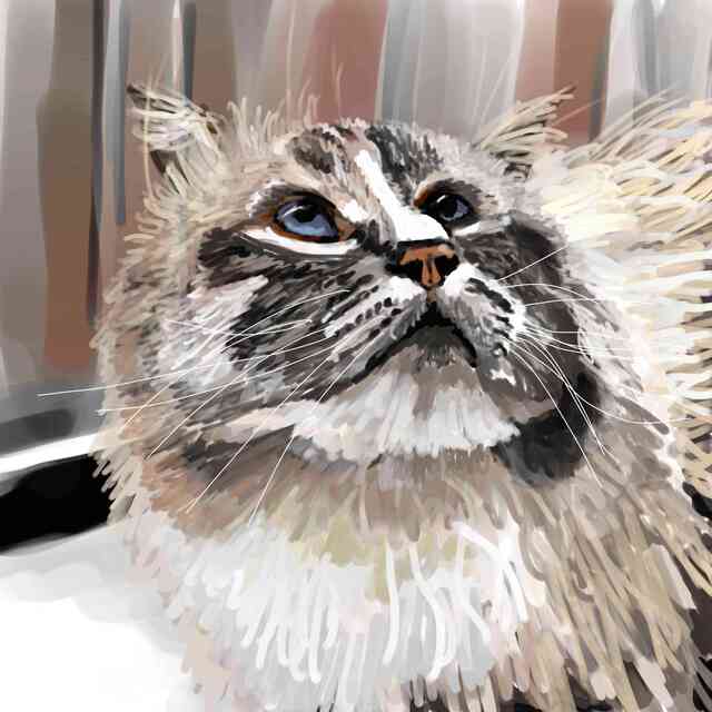
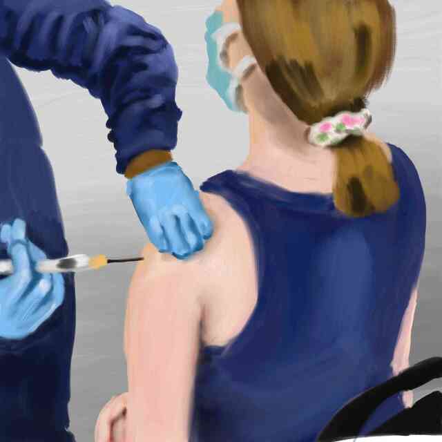
As I got more practice, I felt like I was getting better at drawing from my own photographs in a less literal-minded way; here’s a drawing I made from my own photos:
Color and tone
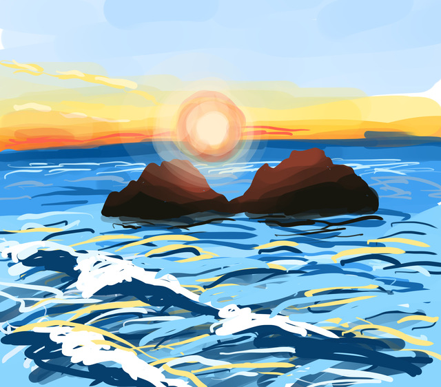
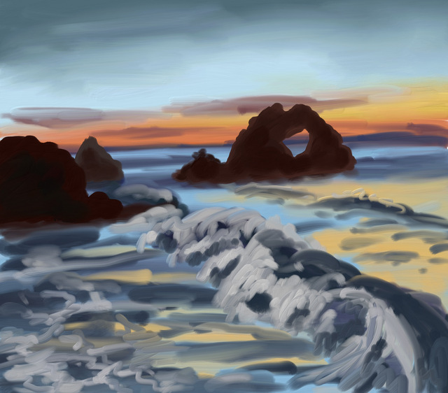
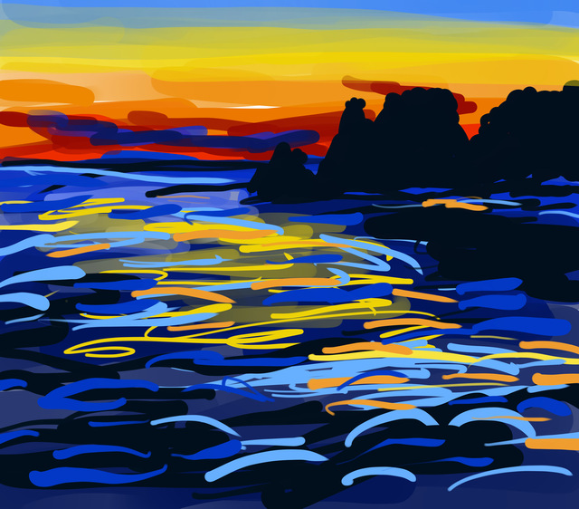
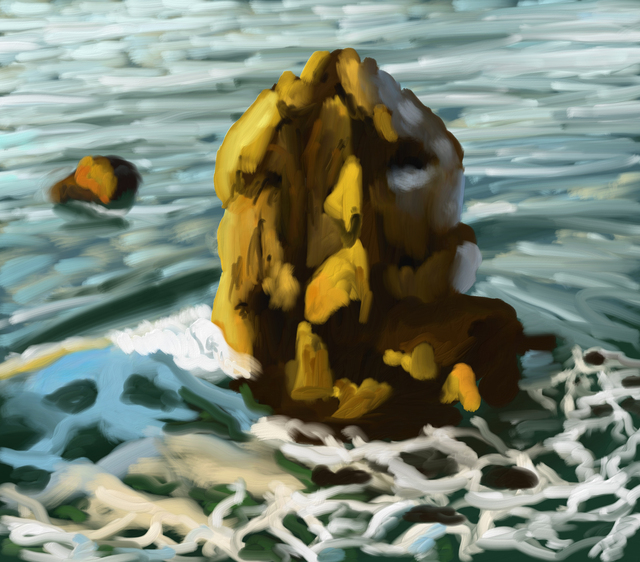
Here’s another comparison. Here are four iPad drawings from the same day. The first three I made in sequence, watching a sunset over Seal Rocks; each took about 5-10 minutes. The fourth was drawn from a photograph that night, at took around, say, 30 minutes.
Here’s a photograph that I took around the time of the second sketch, and the reference for the fourth:
The photos looks much more realistic than my paintings, but I don’t feel like they quite capture the vibrance of the colors and the sunset.
In painting from life, especially in the wide dynamic ranges of the outdoors, one often struggles to find the colors and tones, since you can’t just draw the colors you see. Photographic color in an outdoor scene with bright lighting is quite distinctive.
But it’s hard to make a fair comparison between paintings made quickly under time pressure (due to changing light and waves, cold weather, and making my friends wait), and paintings made in comfort at home from a static image.
Here’s a sunset painted from life, where I was really hunting to figure out what colors to use:
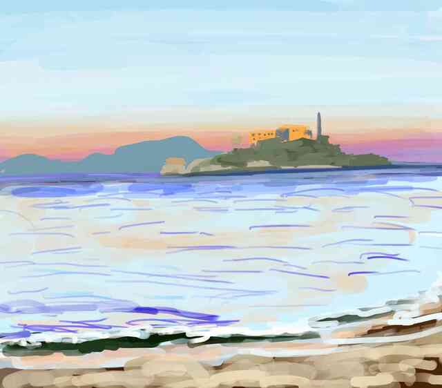
I like the unexpected way the colors came out; I think it’s more vibrant and unusual than a photograph would have been.
Perspective
Conventional cameras (with rare exceptions) implement linear perspective, a rigid approach to perspective that, in many cases, doesn’t match well how we draw or how we perceive space. So a picture that looks very much like a detailed linear perspective rendering of a scene may look like a photograph.
Here’s a drawing I made from a photograph:
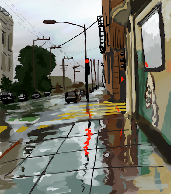
I’m really proud of the light and expressiveness in this one. I think it captures what I saw on the street that’s missing from the photo. But this picture still has a level of detail and precision that, I think, says “photograph.”
I don’t much like drawing with perspective lines, and, even when I do, I’m pretty loose with them. More often I don’t bother:
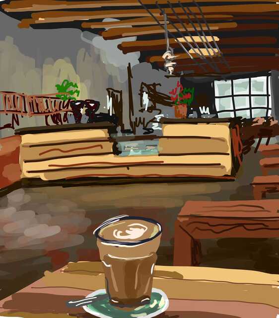
Linear perspective photography isn’t very good at capturing extreme wide angles. This picture was drawn from life, not a photograph:
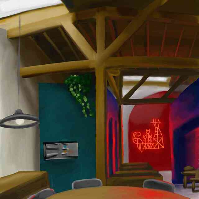
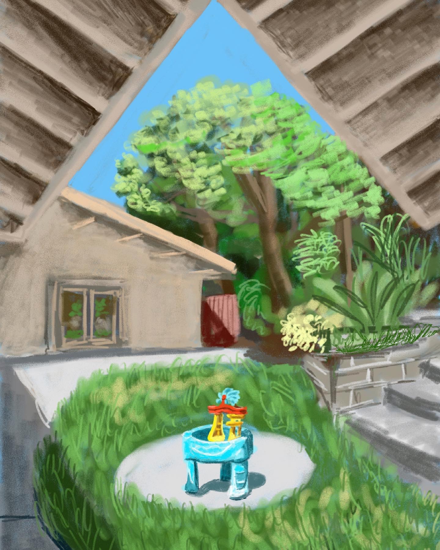
While I think it looks photographic, I think it has a wide-angle perspective that would be hard to capture with a normal camera (without fancy nonlinear postprocessing). Here another drawing from life that might look simple, but would be hard to create with contentional projection techniques:
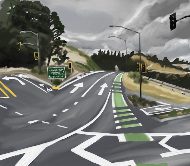
Here’s one I drew from a photo, and I’m rather proud of it. It has a photographic level of detail, but I arranged things in 2D so that the picture is closer to what I saw than what the camera captured, and a composition that I liked in 2D:
Summary: What’s The Difference?
In many of these cases, the difference between painting from life versus painting from a photograph seemed obvious when I was making them. They felt very different. Now, looking back at these pictures, I find it harder to tell, and even harder to articulate the differences. And, of course, I am even less sure when looking at someone else’s pictures. But sometimes I feel pretty confident. Partly there’s the sense of liveliness, but I feel like I’ve gotten better at imparting liveliness when drawing from a photograph.
As I’ve argued before, both painting and photography entail making choices of depiction from the seeming infinitude of sensations we experience in the world. I think the clearest cases are wide-angle pictures and high-dynamic range scenes, where the limitations of photography mean that photographic choices may often be quite different from those made by a painter. Linear perspective photography captures large-scale scenes in a way that feels a bit rigid and too detailed to me, in contrast to human perception of the same scenes.
Photographic color has changed a lot over the decades, and, now that smartphones are doing a lot of sophisticated tone-mapping, the look is quite different from, say, older film cameras. So judging whether a picture looks like a photograph depends on whether we’re imagining the photo being from the 1970s or from today. For example, consider the color and tones in this Richard Estes painting from 1979:
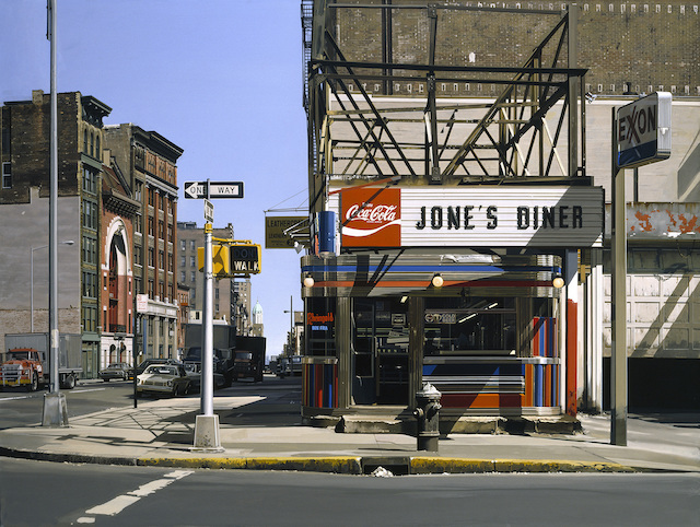
which, like a lot of his older paintings, feels straight out of a 70s movie. (Interestingly, here’s a review of an Estes show that includes ones of his sources, I wonder if more are published.)
Here’s Kehinde Wiley at work:
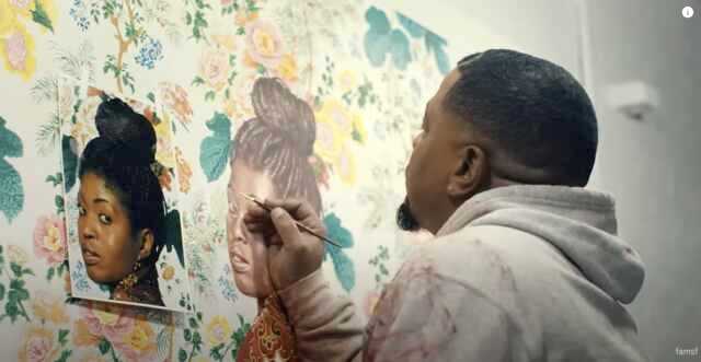
in a video accompanying a wonderful exhibition of his work in SF, from now until October 2023.
Of course, there are myriad external sources of information about how a picture was made. If it depicts a fleeting moment with extraordinary precision, then it feels more likely to have been painted from a photograph. A still life in the studio is more likely to not have had a photo.
One factor is the skill of the painter, as illustrated by the progression in this post. Rob Pepperell, an art professor, told me in email that “with students you can almost always tell if it’s people or animals, it’s probably to do with the fact that they inadvertently copy the artefacts of the process, so the cropping, the frozen poses that wouldn’t be possible to paint in real time, the effects of flash, etc, it often because they are lazy or lack confidence to paint from the subject. With spaces, pretty much the same, you get the typical photo projection of space, whereas when they draw or paint from life it’s conspicuously non-linear.”
In short, I don’t think there’s an easy answer to photo or not in most cases, especially as the painter gets more skillful. But there are several cases where you can make an educated guess.
Back to those paintings at the beginning. The first one:

had a sign next to it proudly stating that all her work is painted en plein air. So it was definitely painted on the spot. Even if you didn’t know this, it clearly does not have photographic colors or tones, it doesn’t strictly follow photographic perspective, or the level of detail or precision that you would see in a photographic work.
The second one is more a more complicated case:

In some of the artist’s Instagram, she works en plein air and others she doesn’t. My first thought was that the above painting came from a photograph, given the precise detail, as well as the depictions of individuals and cars seemingly frozen in time. But one detail is that the red car seems much bigger than the black car, as it would be depicted photographically. I don’t detect any perspective distortion. This suggests more freehand drawing, and/or collage-like composition. The scale and detail seems like it would be hard to capture with a camera as well, unless using a fancy large-format one. Maybe she sketched the space and street en plein air, took a few reference photos, and finished it in the studio. Maybe it was all completed on the street. I don’t feel like I could say.
For myself, I find these different modes of working all valuable. Working from life and working from photos are both worthwhile: you learn something different from each different way of working. Neither is better or worse. Even if I were somehow making a living selling pictures I’d drawn from photos (like, say, with a pet portrait business), it would still be worth continuing to draw from life, and vice versa.
