Choices During Painting: A Case Study
There’s a myth that an artist begins with an intent or inspiration for a picture, and then just executes on that vision. I’ve written a lot about how this is generally false: art and science often involves discovering goals during a process of exploration. Moreover, the process of painting involves a continual series of choices. But I’ve found it hard to give detailed examples of these points from my own painting. During the process, it’s hard to make decisions, it harder to be aware of making these decisions, and even harder to remember the decisions. And there’s something about a finished piece that makes it seem inevitable, erasing all the uncertainty that went into making it.
During my recent sabbatical, I painted a picture that, finally, can illustrate some of the decision-making that went into it, because I remember enough of the decision-making that went into it, and there were enough changes of direction to be interesting. This isn’t my favorite painting, but hopefully sufficient to demonstrate the circuitous nature of painting.
The main point here is: I only started with a vague idea of what the painting would look like, and I changed my mind about it several times during the process. Moreover, the final style was unplanned, but influenced by paintings I’ve seen in the past.
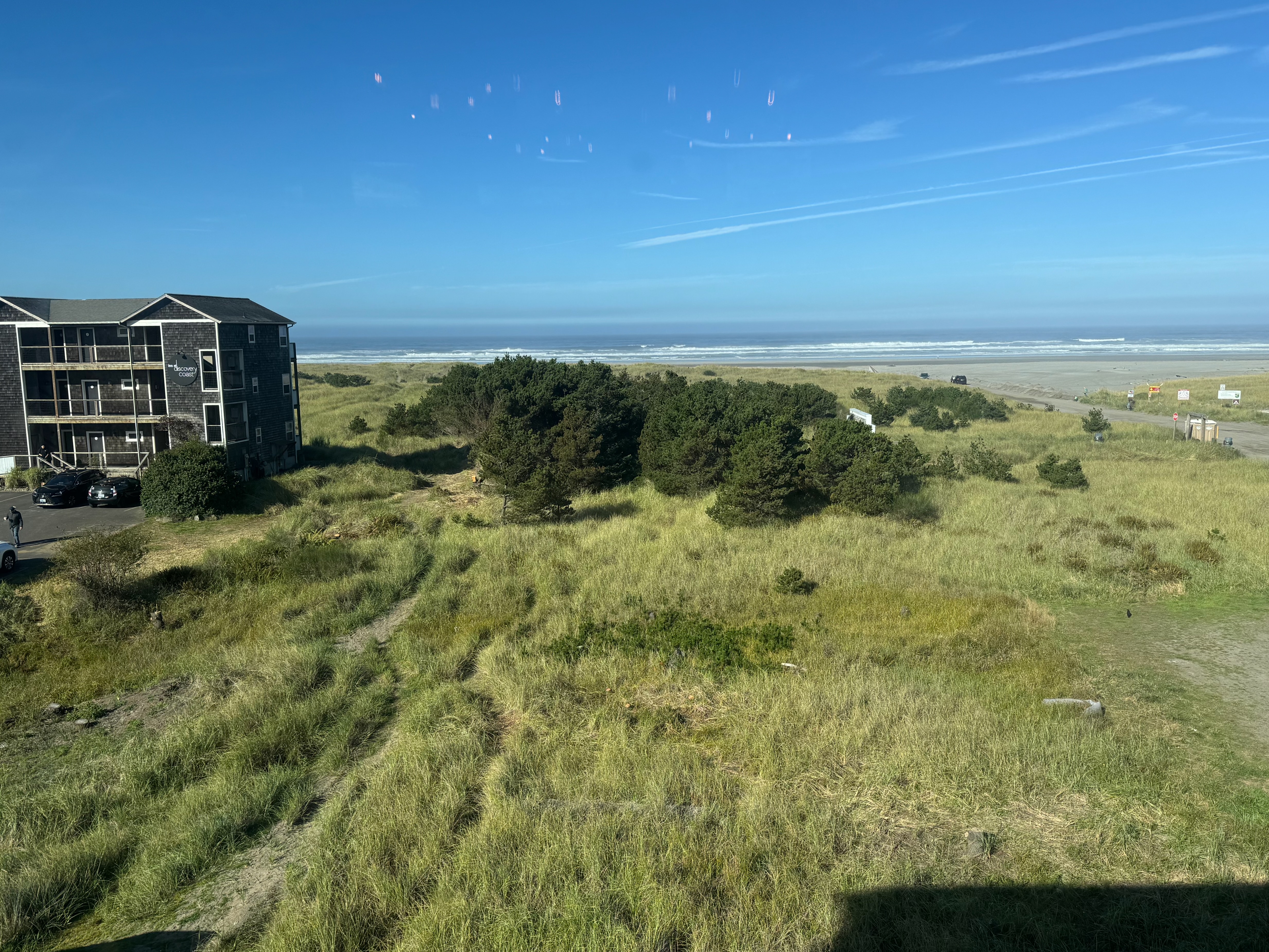
I did it while looking at this view out of a hotel window:
Here’s the full timelapse of the finished painting that I want to discuss:
On the previous day, I’d drawn this sketch:
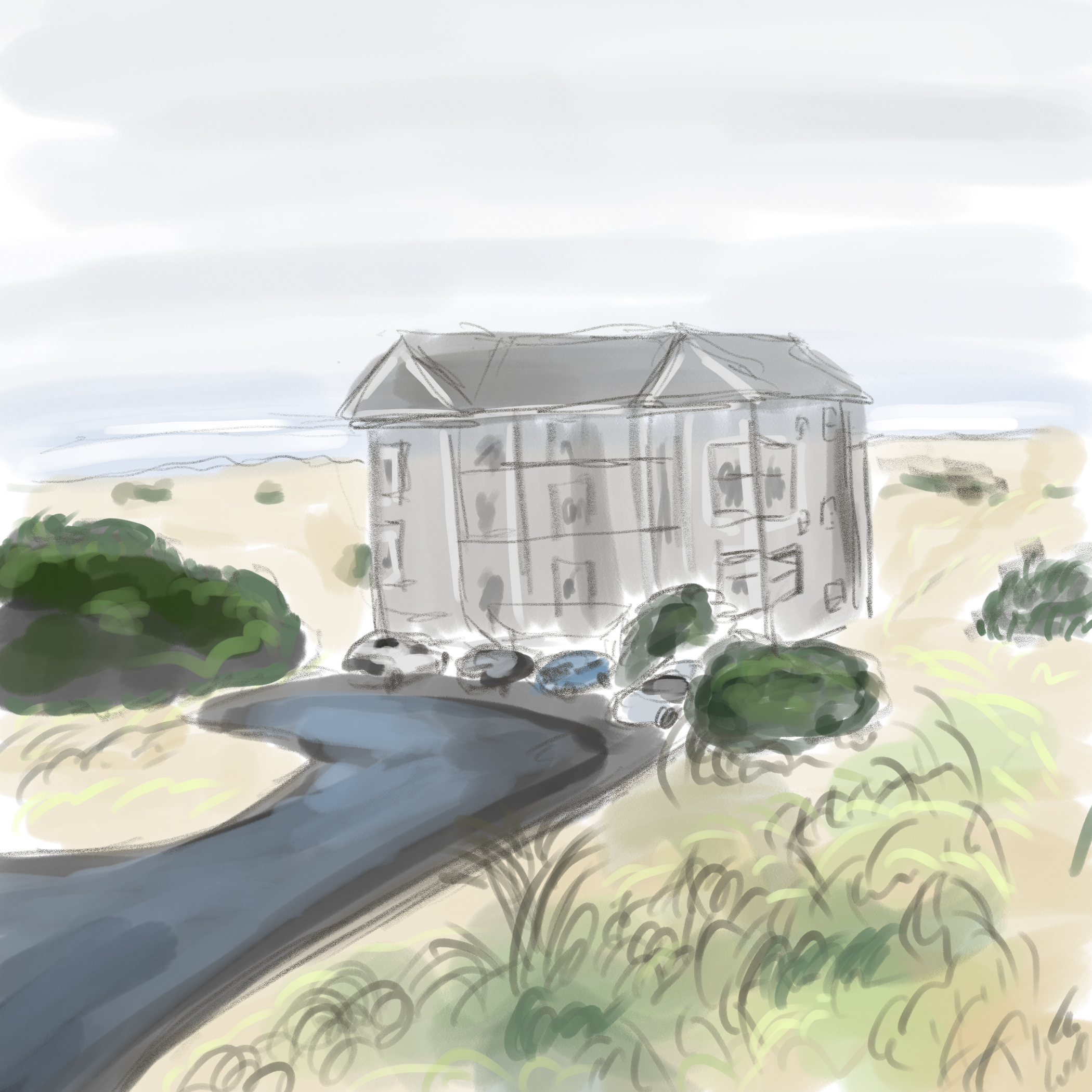
As a subject for the picture, the building naturally drew my eye. On the second day, I had the same impulse to center the building. But I realized that I didn’t want to do that. The building is not that interesting, it’s the open space that’s interesting. So I made a conscious decision to focus on the open space.
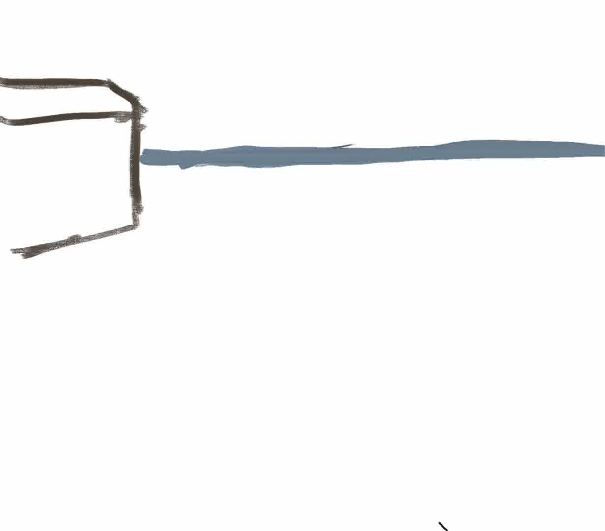
So I started by drawing the horizon and the building:
But even after this I decided to move the building further to the side. So I moved it and then started painting the beach:
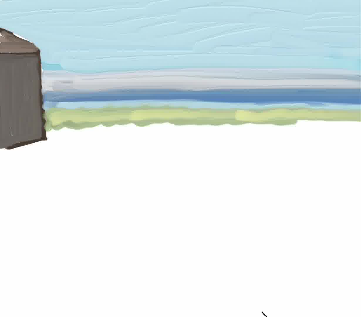
I noticed that I was drawing simple, relatively clean strokes, with the horizon being a set of stripes. I got interested in the idea of doing the whole painting like that, similar to, say, a Georges Schwizgebel animation or Diebenkorn: solid geometric regions, rather than the more sketchy stuff I normally do. Maybe I’d do the whole painting with this simple, geometric look.
The then I started filling in more of the mid-ground region. I composed three main elements in the center, selecting from the real scene and distributing them horizontally on the canvas:
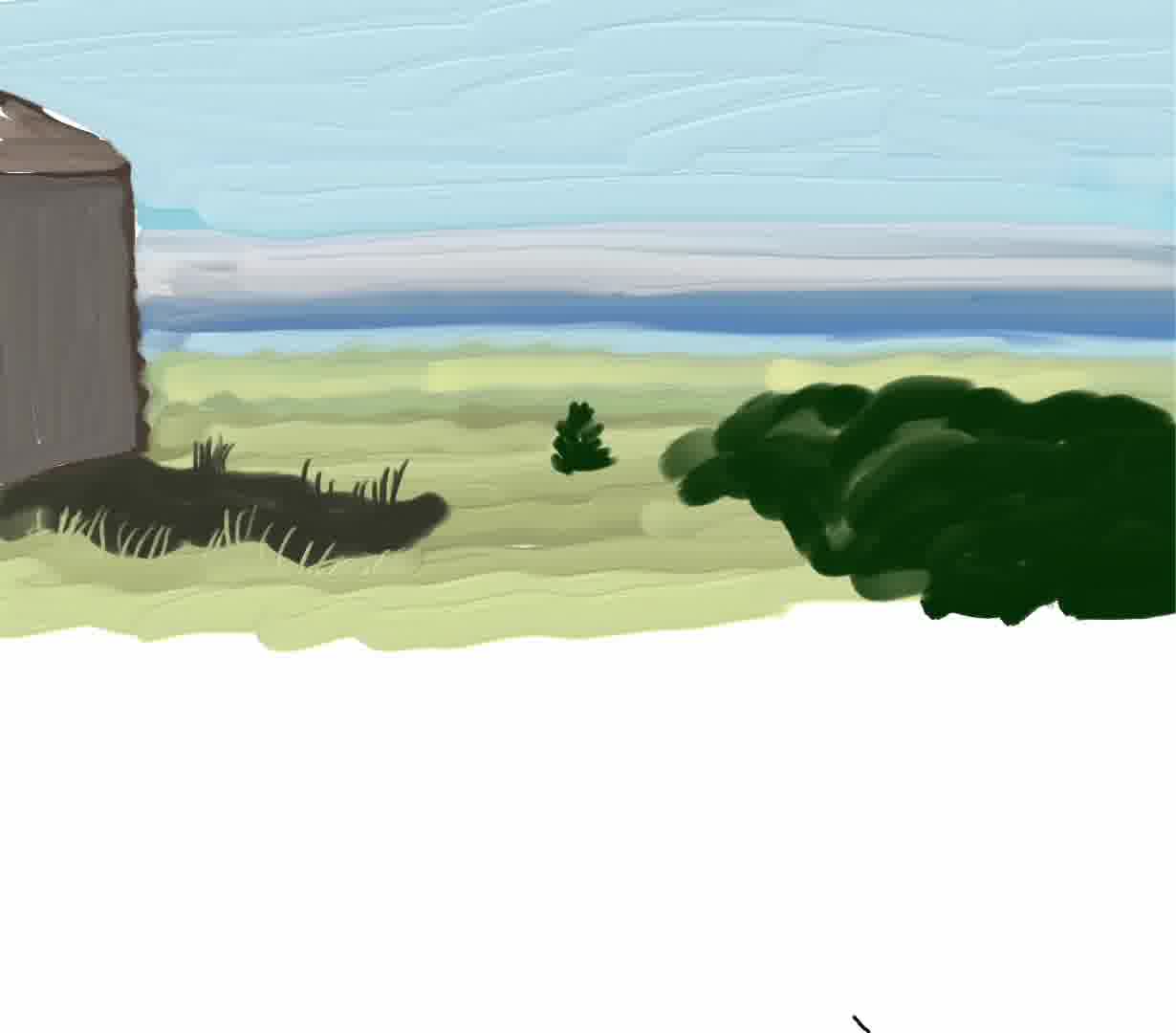
Then I added some texture, enough to get a sense of what it would look like:
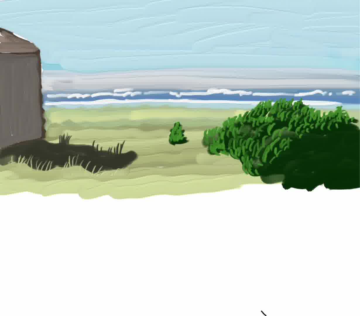
It would have been easy to just spend all my time filling in those details. But at some point I realized it was enough for now—time to move to the foreground to finish the initial composition.
The real scene had a lot of texture and detail in the foreground. Of course I couldn’t draw all of it. I drew rough versions of some of the shapes in the real scene:

Then I thought I’d draw lots of detailed grass texture, lots of little blades of grass:
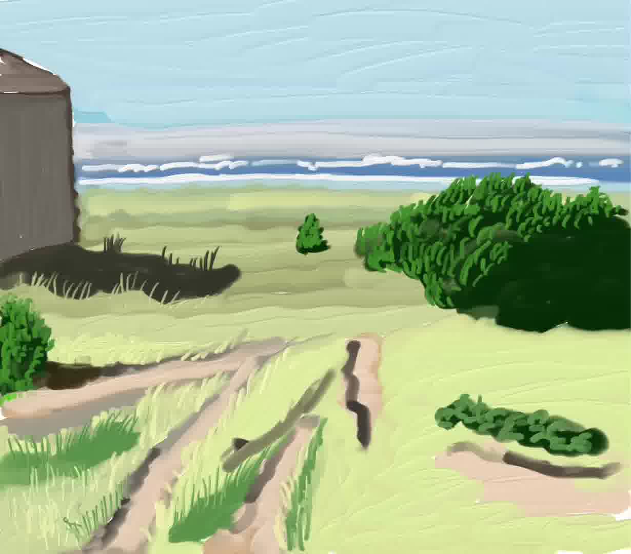
This is a really different style from the simple geometric idea I’d had a few minutes earlier.
But after awhile, painting all these blades of grass seemed too time-consuming and not worth it. So I pressed “undo” a bunch of times:
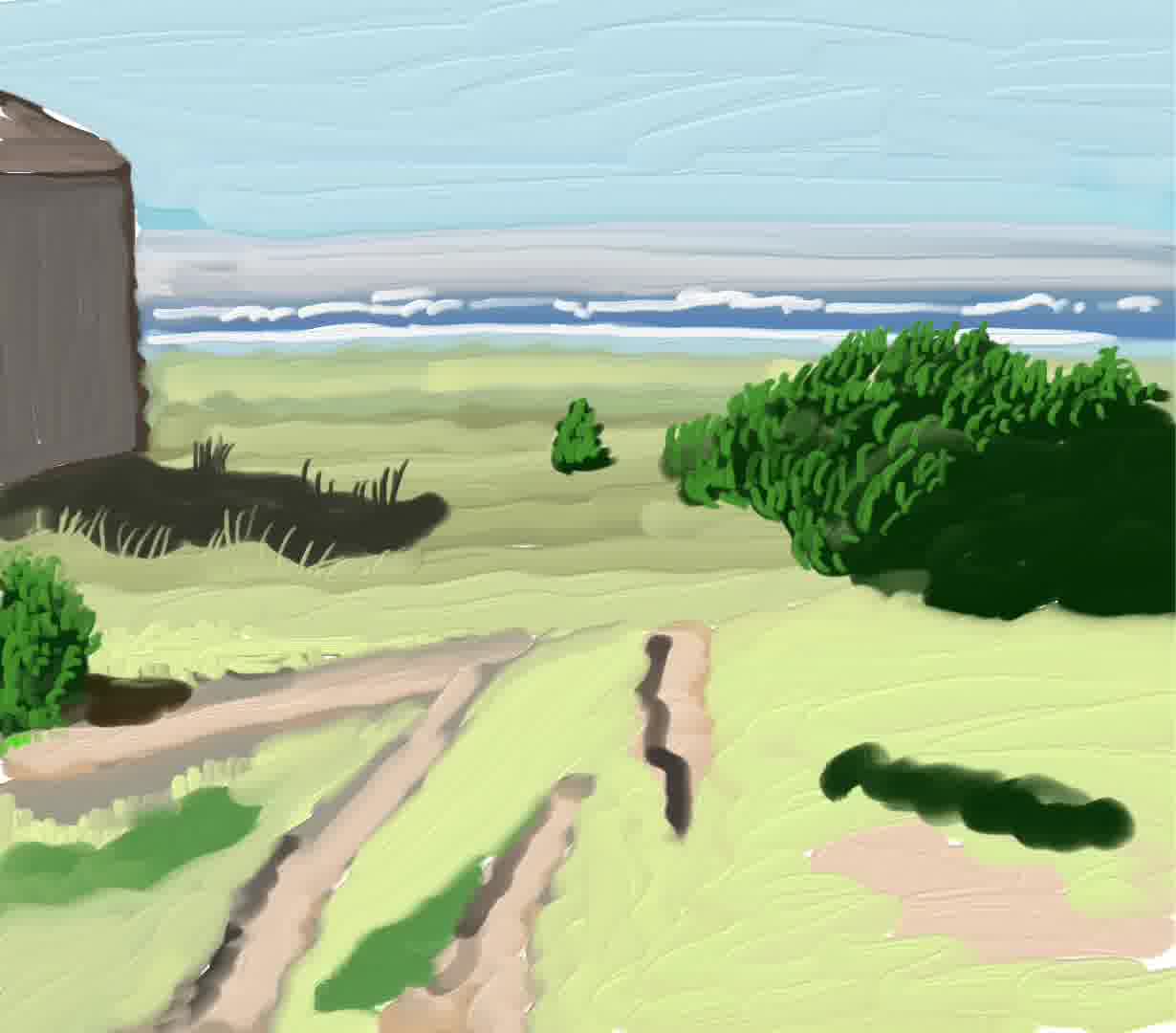
Then I started to use a much larger brush to draw the grass texture:
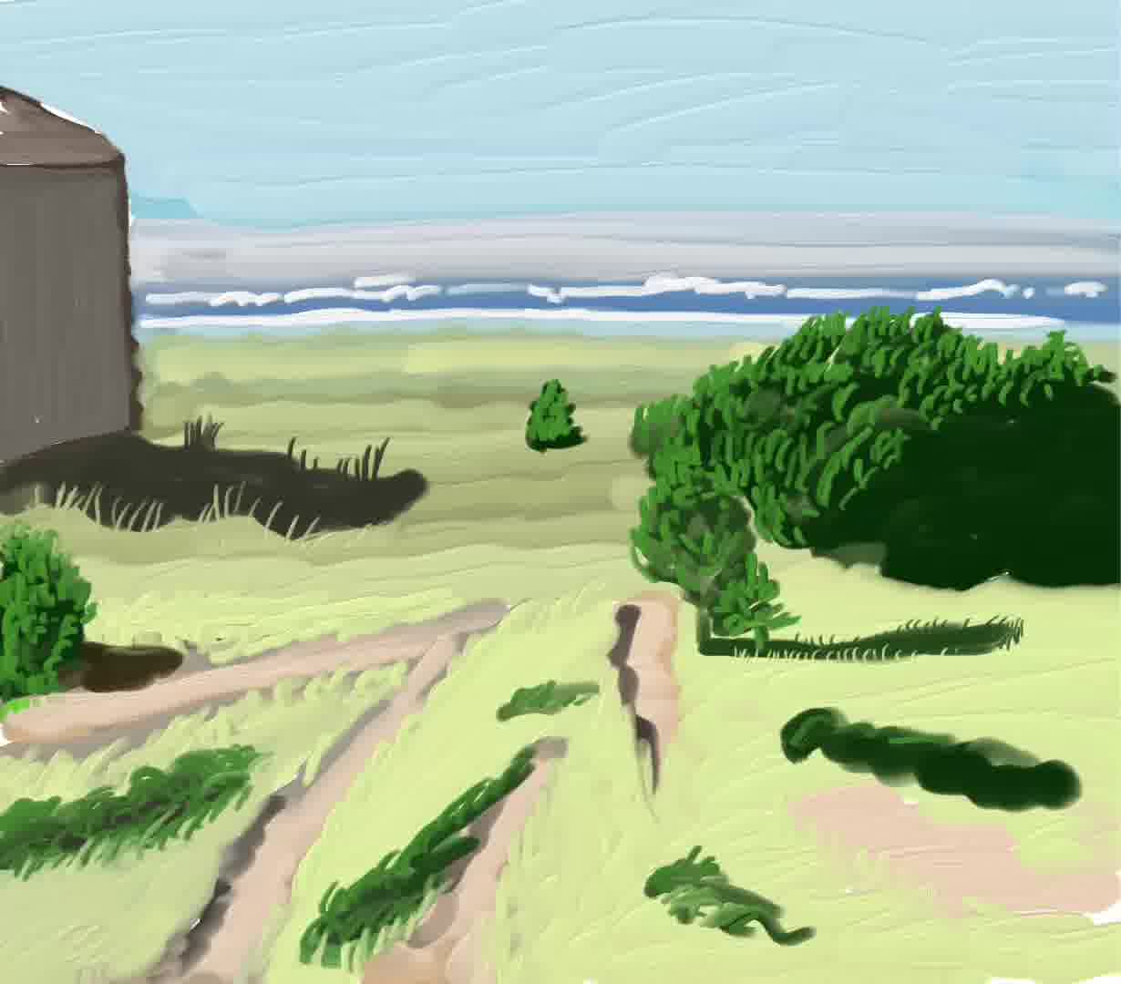
As I started to draw these textures, I became conscious of how different it was from what I was seeing. But it also reminded me of some David Hockney iPad drawings I’d seen. This gave me a sort of “permission” to continue: the feeling that maybe this was something to expore rather than avoid.
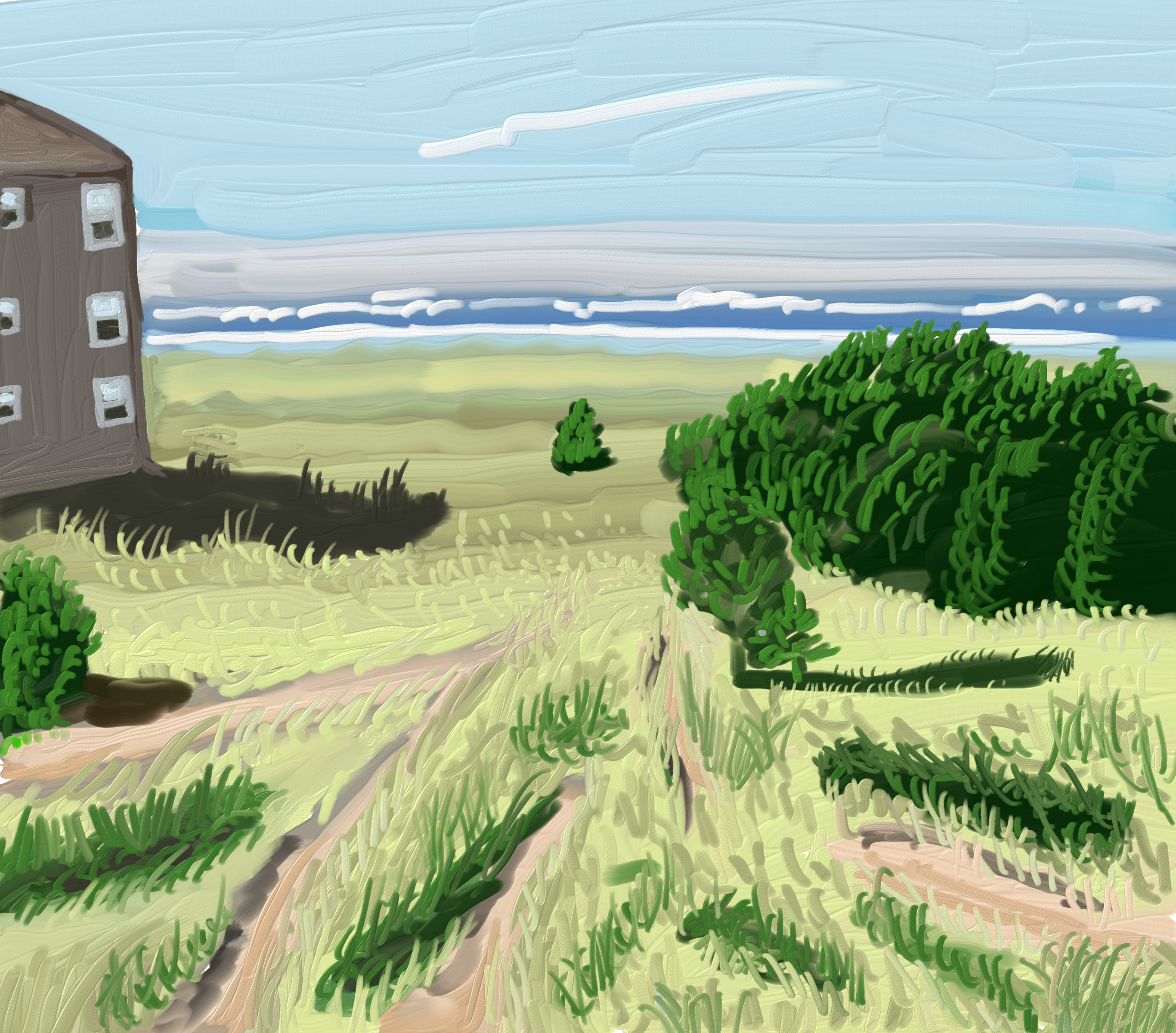
Then, the rest of the time was just filling things in. Here’s the final painting:
Here’s the portion of the view that contains the elements of the painting:
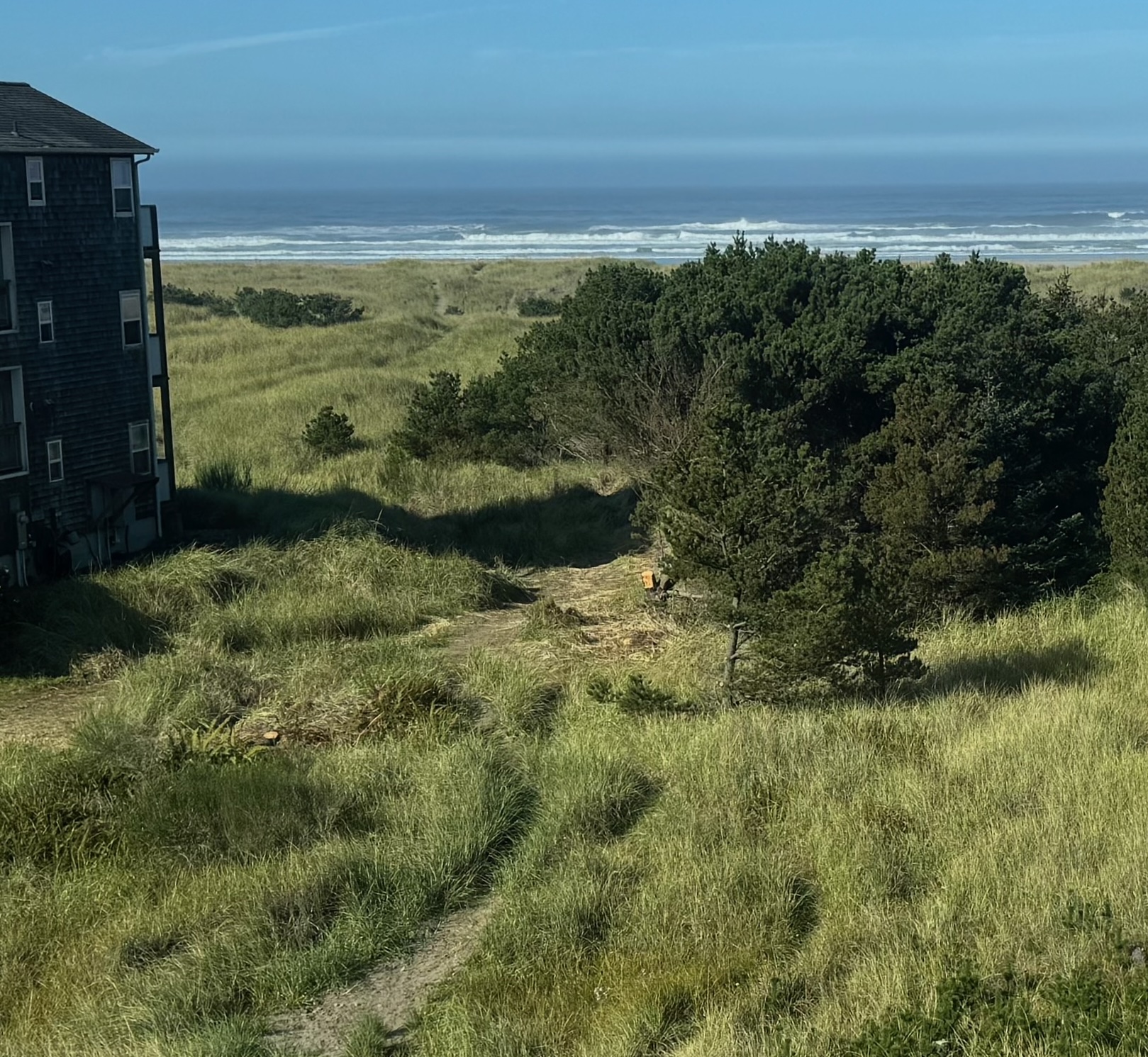
In the painting, you can see that elements of the view are arranged differently in the canvas than in the photo. The painting contains a few different styles from different phases of the process: the relatively abstract beach and sky, the moderately-texture mid-ground, and the most-textured foreground.
The final painting has more distinct shapes, more like distinct objects, like caterpillars or single-celled organisms or paisley, or more like abstract art shapes. None of this was planned. This style was definitely not intentional or planned, it’s something I stumbled upon, and I wouldn’t have had I not spent time looking at David Hockney paintings sometime in the past.
None of these choices, or the styles within, were planned.