Learning from Painting, Part 3: Planning and Strategy
In computer algorithms for image stylization, we tend to think of an image’s “style” and its “content” as being independent, and we can apply any style to any image. In my own experience with painting, however, I found that the style was a function of the scene I was trying to depict, because different challenges required different strategies.
As described previously, the choices I made early on in a painting could completely change the final outcome. This post describes some more of those choices in detail, how they depended on the scene, and how they affected the final painting style.
This is the third part of a series of blog posts about my recent experience in digital painting and drawing. Click here for the first part.
Picking a subject
The first choice is what to draw in the first place. During my sabbatical in Fall 2019, I got in the mode of looking for things to draw.
If you’ve ever enjoyed photography for its own sake, then you’ve had the similar experience of paying attention to the things you see, evaluating them as possible pictures, considering different framings and image compositions, adjusting image filters or exposure, shutter, and lens settings. It’s a habit that changes how you see the world around you, and how you explore.
Picking what to draw or paint was quite similar. That sculpture I saw at the museum would be fun to try to draw; that street scene is lovely but too complex for my skills, and also an awkward or unsafe place to be standing around for 30 minutes.
Just like a photographer builds their intutions about what kinds of things would be interesting to photograph, practing painting helped developed my intuitions about what kinds of things would be interesting to draw as well. As I got better, what I thought would be interesting to draw changed, e.g., some things were too difficult at first, and too simple later on.
Planning
When I started drawing during my sabbatical, I would often draw straightahead without much planning:
I’m eager and want to get going with drawing the fun stuff.
But sometimes the composition didn’t come out quite I wanted that way. So, for more complex compositions, I would plan the overall composition first, by sketching an outline:
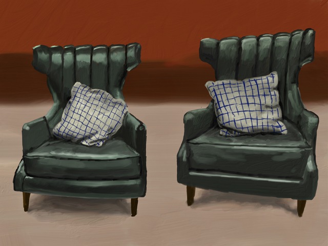
In this early example, once I started filling in the shapes of the chairs, I tried to draw all of the lighting reflections directly.
I also experimented with a third way to plan, by blocking out solid shapes, and then refining details:
In this case I first blocked out colors, and then painted wet-into-wet to adjust and refine many of the lighting and colors. This process can be thought of as analogous to working coarse-to-fine. This example was also one of the first times I experimented with transparency and layering for glassware.
Each of these different styles of planning produced different styles of painting. Planning improved the overall composition while removing some of the spontaneity of the drawing, and taking time away from working on details. So I would plan based on my goals for the painting.
As I progressed, I ended up with hybrid strategies. At any moment, different subtasks all seem to demand attention: planning the drawing, adjusting the composition, painting and refining details, stepping back and seeing how things are going.
For example, when I watch this timelapse of a painting from just after my sabbatical, I see myself jumping around. It looks like I first wanted to have rough background colors in place, then I got distracted trying to capture the nuances of the clouds, then I went back to planning (sketching the building outline), then I blocked out colors within the buildings, then I refined some details, and so on.
Here’s another example of a more complex mix of strategies:
Grouping
A key element of these different plans is grouping: which objects or surfaces will be combined together into single 2D shapes? This notion of visual clustering—which is so key to many classical approaches in computer vision and some in non-photorealistic rendering—determines a lot about visual style. Will an object be drawn with one stroke, in one color? Will it be broken into multiple strokes? Will it be drawn as a solid shape or a collection of little strokes? Will the highlight be separate strokes, or blended in?
How an artist groups objects into coherent units plays a crucial role in the painting, determining the visual style, and the time and difficulty involved in making it.
Strategy
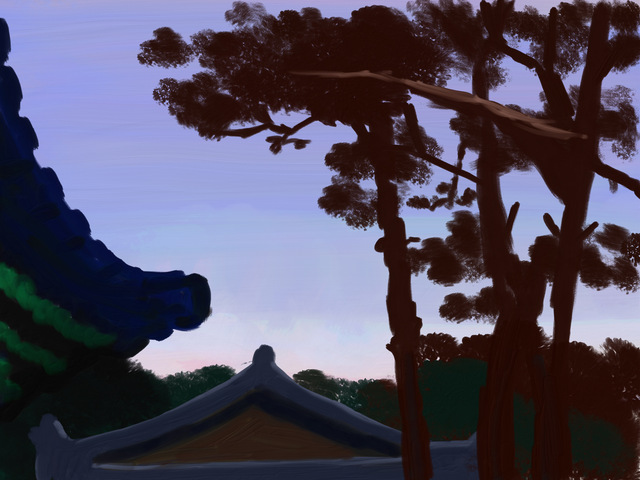
I came to see the challenge of depicting a scene as one of choosing a strategy. For example, clouds have rich, subtle, painterly shapes with enormous amounts of fine detail. Plus, their shapes transform continuously as they move in the wind. It’s hard to know what to draw. Likewise, tree presents a big challenge because one cannot draw every leaf, every variations of shading and every branch. For these tress, I tried painting clumps of leaves in silhouette, “dabbing” the virtual brush:

How objects are grouped plays a big role in these strategies, e.g., grouping leaves together to be depicted as a unit.
Drawing glassware was also a big challenge: they have complex sets of reflections, layering, and transparency. I experimented with a bunch of different strategies for dealing with this, including using drawing layers and different types of brushes. Here’s an example from a month or so after sabbatical, showing some progress from the beer glass above. There is a separate specular layer on the glossy surface of the table, drawn with a solid, flat brush, and I used the eraser tool on this layer to create shadows in the reflection layer:
I spent a lot of time practicing shading and lighting, and refining my strategies for painting light, often by painting multiple passes:
or painting wet-into-wet, mixing digital paint on the canvas:

Introspection is Difficult
I make a lot of conscious decisions when making these paintings. Yet, looking back, there are so many choices that I can’t explain. Just as I can’t predict how a painting will turn out, I can’t tell you how I made a lot of decisions along the way.
I spend a lot of time thinking about what my thought process was I some cases, I look back at a brushstroke I drew that I liked, and I wonder how I chose that stroke. Other times I look at strokes I drew that don’t quite look right, and I keep refining them. Why did some “work” and some didn’t? Or maybe they don’t look as good as I think at the time, and I won’t like them later. Why did I decide to sketch these outlines and not those? All of these decisions and judgements seem ineffable. Moreover, there is a lot of evidence that human judgements of our past decision-making can be unreliable. So it is difficult to explain anything with confidence.
Additionally, the paintings on this page were done over a year ago, and so I don’t remember many specifics of the decisions here.
In non-photorealistic rendering research, many researchers start trying to develop algorithms by talking to artists or by reading art books. It’s something I’ve heard over and over: “Our plan was to ask artists how they work, and then turn those into algorithms.” They quickly become frustrated: artists have lots of useful things to say, but these explanations don’t translate into actionable advice. In general, I find that artists’ explanations for their decisions are like sports interviews: they might reflect how people think, but they don’t explain it.
I the observations in these blog posts could inform better artistic algorithms. But, like any other sort of human decision-making, no description of artistic experience will directly translate into algorithms.
The next post in this series is here
The images on this page were drawn in September, October, and November 2019.