Learning from Painting, Part 6: Abstract Painting
“Painting is the grandchild of Nature.” — Rembrandt Van Rijn
Abstract art can provoke anxiety: do I like it? If I don’t get it, am I an uncultured slob? If I do like it, am I a pretentious jerk? I suspect a lot of people have felt these things. But, more to the point, even when I’ve gotten over this anxiety, I’ve had no idea how to create it.
In the past year, I’ve finally found some useful conceptual frameworks for thinking about abstract art and techniques for creating it. This experience in turn has led me toward slightly more concrete ideas about the perceptual basis for abstract art.
This is the final part (for now) of a series of blog posts about my recent experience in digital painting and drawing. Click here for the first part.
Tiptoeing toward abstraction
In retrospect, a few things things recently helped me. The first was the time I spent recently learning about the current art scene—and not just the textbook artists of the past century—and just looking at lots of images.
Second, I had, in the back of my mind, a desire to explore abstraction more, even though I didn’t know how. So, at first, it started accidentally.
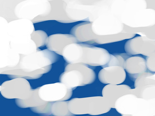
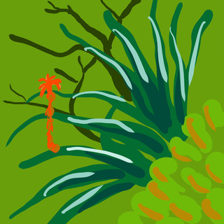
Normally, I only use about four different brushes in my drawing app which has literally hundreds of brushes to choose from, so I decided to go through them and experiment with the other brushes to see if there were any that I liked. I started experimenting with different brushes, and, even though I was basically just doodling, ended up with drawings that I actually liked:
Are they “good” “art”? Self-indulgent doodles? They didn’t get many “likes” on social media, but I still kinda liked them.
With abstract images, I am consistently much more uncertain about them than I am with realistic images: how much do I like these images, or whether they’re any good, or whether other people might like them. Of course, one would like to say that one is not influenced other peoples’ responses on social media, in which case one would be shamelessly lying.
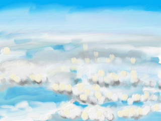
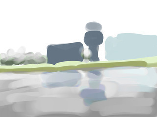
Working fast and loose was my main way to dip my toes in the waters of abstraction. On two occasions, I drew a series of sketches while looking out airplane windows. The scenery changed so quickly that I could only get a glimpse of an image before it changed:
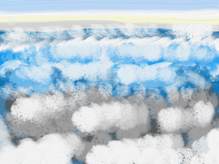
Some of these got some very positive feedback on social media, which really surprised me.
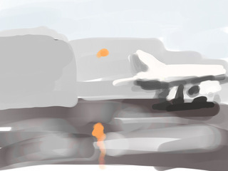
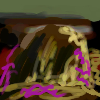
Here’s one last example. I painted this literally while walking on the beach and trying to keep up with my friends. I had a hard time seeing what I was doing in the sun. So it is fast and loose and roughly drawn, without refinements:
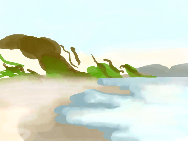
Despite its lack of appreciation on social media, I was quite fond of it.
Stuck at home
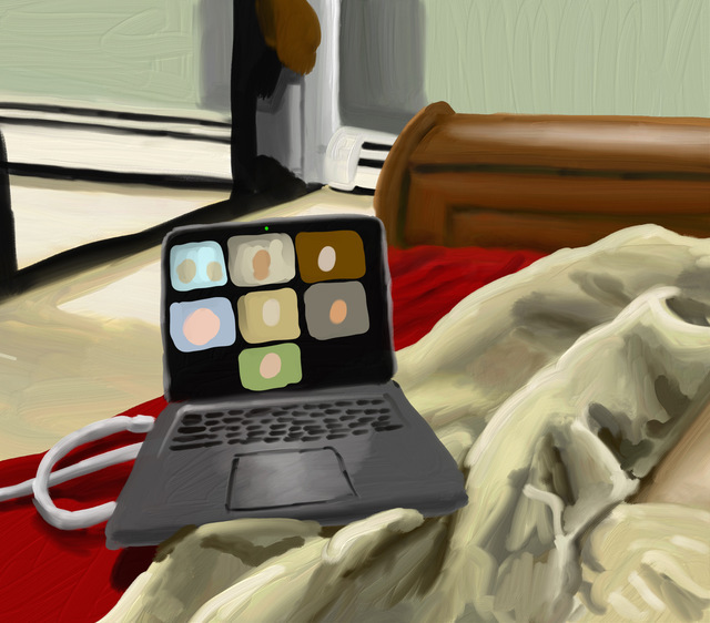
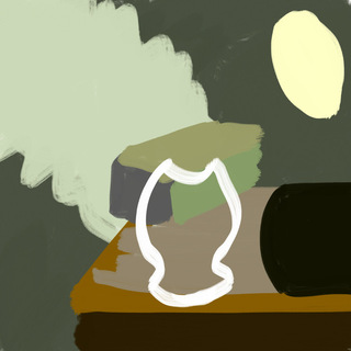
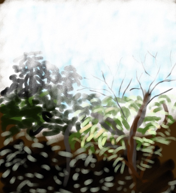
Since the pandemic started earlier this year, I’ve had a lot of time at home. I painted things around the house for awhile, like this view of my early-pandemic social life:
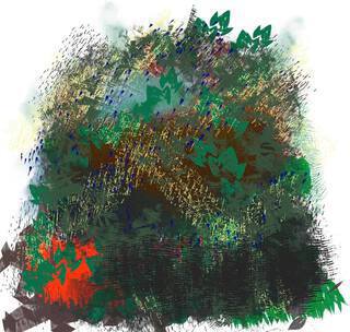
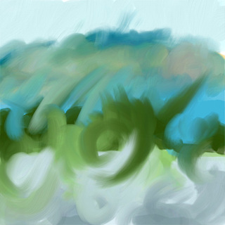
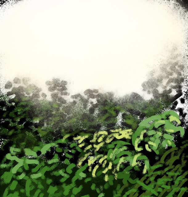
As I lost steam drawing the same old sights at home, I tried making them more and more abstract; occasionally the results were ok:
but usually I didn’t like the images, they just felt like pointless doodles:
Indeterminacy
Why and how would we appreciate abstract images, scientifically? A few theories over the years have intrigued me. Aesthetics must be somehow be a consequence of the biological perceptual systems, which in turn are evolved to help us survive in the real world, and this should apply to abstract imagery too. But formulating a concrete theory is obviously difficult.
One abstract artist I’ve always liked is Richard Diebenkorn, in part because you can easily see how his abstract paintings are related to his landscapes. This suggested to me a possibly way to understand abstraction aesthetics, as containing “features” of real images, such as a beach color palette. One interesting paper argues that Jackson Pollock paintings are appealing because they reproduce a certain kind of fractal natural image statistics. This is a very intriguing idea, even if the particular statistics used in that paper don’t seem very meaningful. Still, both of these ideas seem far too simplistic to be useful.
In Spring 2019, I came across a fascinating paper by Robert Pepperell on “Visual Indeterminacy” a term he uses to describe images that appear comprehensible at first, but that defy coherent explanation. He describes various connections of this idea to art history, and, this idea, together with the idea that modern art values ambiguity, not certainty, gave me a better way to think about abstract art. It’s summarized by this quote from Picasso: “When looking at a picture, one should say that the more associations it can open up, the better.” Abstract art strongly suggests various visual concepts: objects, relationships, moods, emotions, without making any definitive statement beyond the elements of the image itself. Incidentally, we’ve recently begun exploring some of these ideas in a more computational setting.
Richter
That paper also made me pay more attention to the Gerhard Richter’s work, which, it turns out, I really like. It helped that I saw several large paintings by him at the SFMOMA multiple times last year.
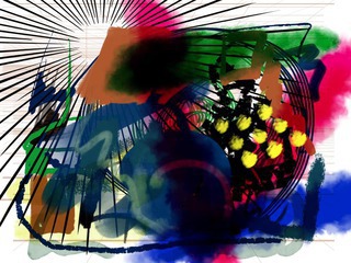
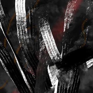
In my previous experiments with abstracting, I worked fast and sketchily. But that changed after I watched a documentary about him, and in fascination I watched him carefully drag yellow paint across canvases with a piece of plastic. The next time I tried painting, I moved the brush slowly, and paused to contemplate the canvas after each stroke, before picking whatever next brush and color felt right. I chose colors imitating Richter’s color palette, and kept going until, like Richter says, “there is nothing left to do.” I ended up with this:
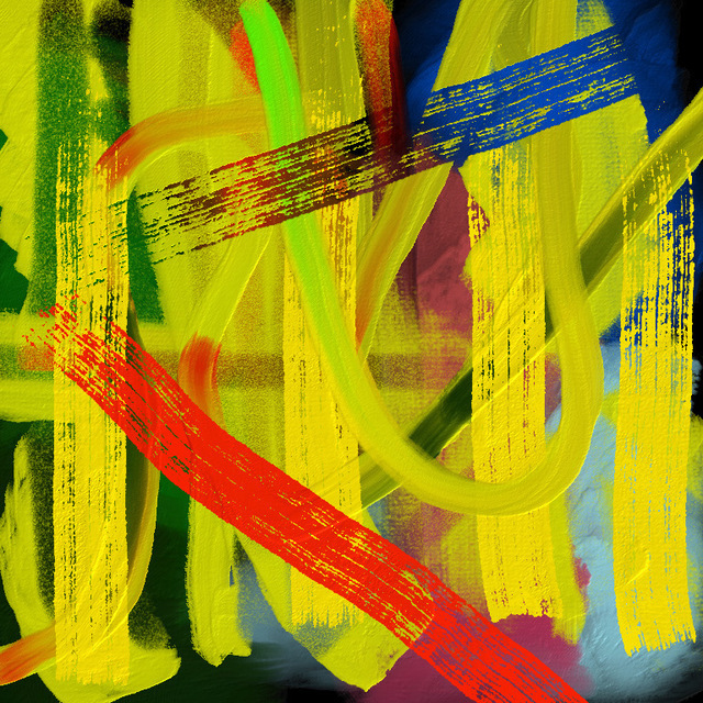
which I really liked. It felt like a bit of a breakthrough. But maybe I still just doodling? This image got some positive response on social media too, which as surprising as it always is, seemed like a good sign. When one friend said she liked it, I asked if she could articulate why, and she said she couldn’t.
It seems like this image, and other abstract works I like, does capture some familiar notions of image appearance: color, layering, texture, shape, junctions… I cannot articulate how it works, but I think that there is a indeterminate reference to familiar visual structures.
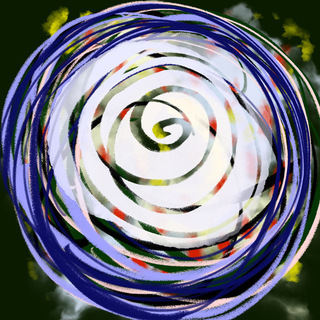
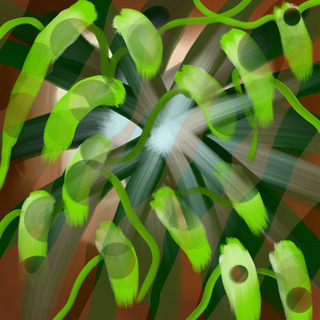
I tried to create more following the same way. I would often start with some sort of “real-ish” scene, and then add “natural-ish” textures and strokes. Here are some of my favorites:
These last two were experiments with Richter’s occasional approach of messing up a photograph or realistic painting.
Here are two that I don’t particularly like, but yet they got more positive comments on social media than the ones I do like. I’m not sure what to make of this, though lots of artists have said they’re surprised by which things people like.
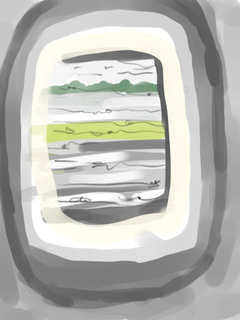
Window paintings
I lost enthusiam pretty quickly; abstraction is really hard! Most of the time it does feel like aimless doodling.
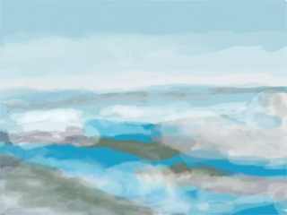
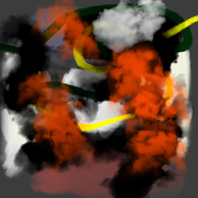
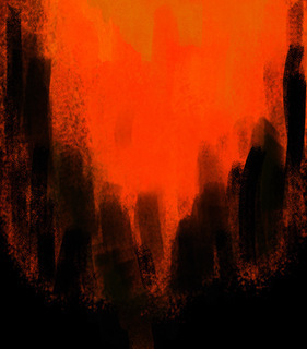
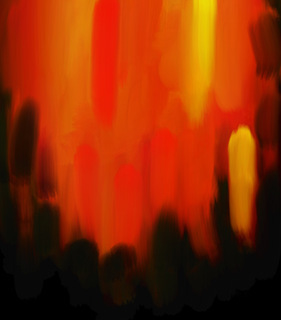
But, on the morning of September 9, 2020, smoke from wildfires, high in the atmosphere, turned our skies a dark red-orange. It was gorgeous and alarming, like waking up to discover you’ve been shipwrecked on Mars. I painted impressions based on the view out my window:
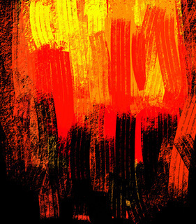
The next day, the smoke descended, filling the sky with smoke and yellow light:
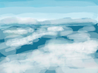
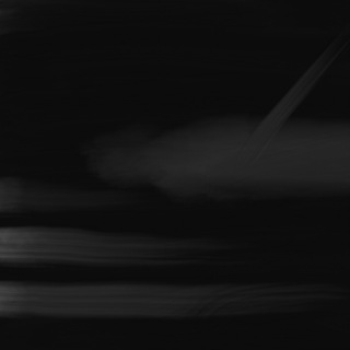
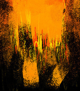
Things improved on day 3:
and the skies were blue on day 4:
What Have We Learned?
I take away the following ideas from these experiences.
I think that abstract art functions by reference to our visual experience, but in ways that are richly complex because our visual experience is rich and complex. Our visual experience, in the modern world, includes not just cities and forests but also graphic design, television, and other artworks we’ve seen. For example, works by Frank Stella refer to our visual experience of graphic design and mechanical objects; works by Louise Bourgeois combine mechanical and organic elements. Abstract art combines visual elements in unusual and striking ways, and there are many different things this means for different works.
Conversely, for me, the experience of painting realistic images was a prerequisite. Just as viewing abstract art builds on real-world perceptual experience, creating abstract art builds on experience painting the real world. It used the skills I’d practiced and developed for realism: composition, motor control of strokes, contemplation of an image, iteration, building and trusting instincts. The biggest difference was there was no reality to provide a target, I had pick some random starting point and then just try to make a “good image” somehow.
And I still have a very weak notion of how to do this; many of my experiments end up disappointing. I also have very little sense of which of my images might liked by other people. Abstract art is hard.
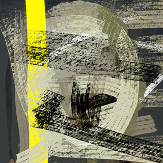
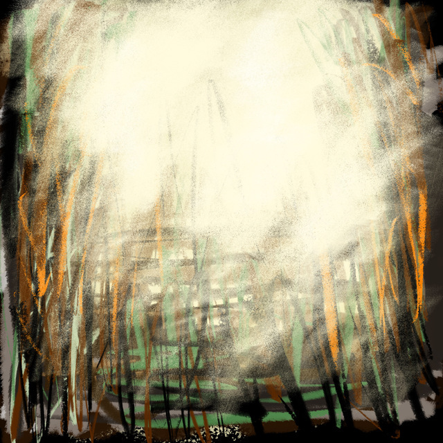
Here’s my most recent experiment. It started when I was doodling while watching TV. The doodle didn’t look that interesting. Then, later on, I wanted to try out some new features in a painting app, so I loaded this image (accidentally upside-down), played around with it some more, and then somehow had an image that I actually liked enough to share:
In summary, 🤷 .