How to Draw Pictures, Part 4: Line Thickness
In previous blog posts, I described simple algorithmic models for drawing. In this post, I’ll expand on a specific element of style: line thickness.
Specifically, this post is about a theory for line thickness in drawing 3D objects. I developed this with Todd Goodwin and Ian Vollick, two talented Masters students, and we published it in a paper in 2007. I haven’t received much feedback or interest in the work, which could be for many reasons, and the theory is difficult to validate or “prove.”
Nonetheless, I believe there is some valuable insight in these ideas, and they provide some interesting rules-of-thumb for how to draw lines, at least in certain styles.
From abstracted shading to line thickness
The basic idea is quite simple. In abstracted shading, we can render a 3D object with a white material and a single light source at the camera position:
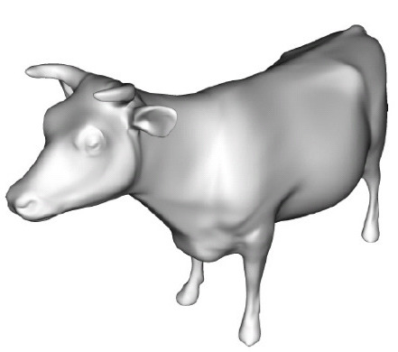
In our theory, we imagine that the representational artist’s job is to draw black strokes that best match this image. We imagine that the artist’s first step is ton get rid of all pixels brighter than a certain amount, and treat the rest as black:
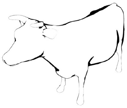
Then, if our theoretical artist uses an ordinary black pen, they could draw curves through all these regions, and all these curves will have the same thickness. However, if they use a brush or other materials that let them control stroke thickness, then they could produce this image:
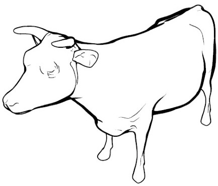
This image is a rendering using our algorithm, which chooses stroke thickness to best match the width of the “bands” of darkness in the second image. The specific details of this algorithm are described in the paper. (Some of the strokes don’t appear to match dark bands in the rendering; this is because those bands are too small to see in this rendering, and the pen is too big to draw such thin lines.)
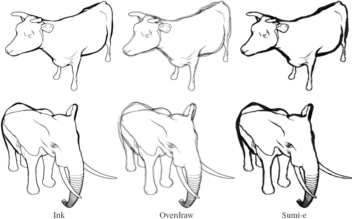
Building on this basic approach lets us design a range of different artistic styles:
I actually first noticed a connection between lighting and brush strokes years earlier, when I came across a 3D rendering made with rim lighting. I noticed that the bands of light that appear in rim lighting often looked to me like delicately curved brush strokes.
Reproducing Examples
The above explanation of line drawings is a very simple, compact theory of line drawings. How well does it really predict real line drawings?
We were able to reproduce a few real drawings with this method. Here are two drawings of a beetle, from a textbook on technical illustration:
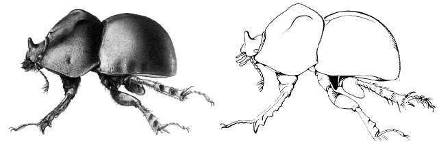
We created 3D models based on the first illustration, and rendered it with a line drawing algorithm based on the principles above:
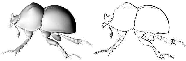
Note that the line drawing looks very similar to hand-made illustration, with similar locations for strokes and variations in stroke thickness. The line drawings look mostly identical, even though the stroke rendering model only has 3 parameters (and two are the minimum and maximum stroke thickness).
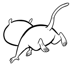
Here’s another example, this time using a panel from a comic book:
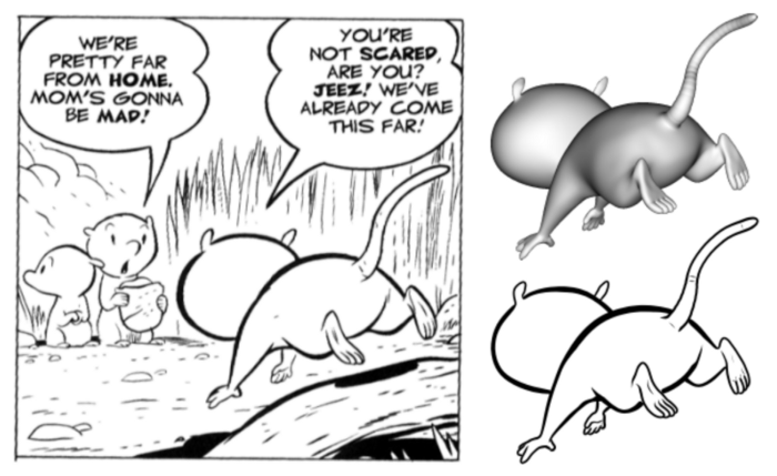
Strokes appear with the same thicknesses and in the same places as in the original drawing. Here’s an animated version of the model. This demonstrates how a simple theory can capture the complex effects in these illustrations.
Predictions and Rules for Line Thickness
In my art classes, I don’t remember receiving any instruction on drawing line thickness, nor have I found much about it in the art instruction books that I’ve looked through. The theory here can give some potentially useful “rules-of-thumb” for line drawing thickness.
Our theory predicts that line thickness will, generally, be inversely proportional to two quantities:
- how far away the object is, and
- the object’s curvature.
In addition, lines can’t be thicker than some maximum thickness determined by the artist’s tool and their drawing style. These values vary along strokes: strokes get thinner at high-curvature points, then thinner at low-curvature points.
For example, here is a rendering of some cylinders with our algorithm:
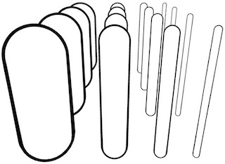
First, observe that the more-distant cylinders have smaller strokes, because they are further from the viewer. Second, note that the thinner cylinders have thinner strokes than the thicker strokes. This is because the thinner cylinders have higher curvature. (Technically, the orientation of the curvature also matters. In mathematical terms, it’s the normal curvature in the view direction, also called the radial curvature.)
When we were developing this work, I spent a lot of time looking through illustrations and comics to see how much they fit this theory. And I found an enormous numbers of different drawing styles, and it was hard to directly test the theory, since we don’t have 3D models to go along with the drawings. Moreover, people draw lines in lots of different ways, and there is no right or wrong way; I think viewers are much less sensitive to line thickness, and often artists may not pay attention to nuances of line thickness or they may deliberately stylize lines in very different ways. When I draw, I find these rules somewhat useful, but they are difficult to follow precisely.
Nonetheless, I found many trends that do match our theory.
From this theory, we can make several predictions, or, perhaps, rules-of-thumb for drawing, and I’ve seen these repeated throughout many different drawing styles. As explained in our paper, all of these rules are consequences of our theory.
-
Objects further away have smaller strokes.
This rule seems widespread in many drawing styles and easy to find in many drawings. For example, in the comic book example above, compare the strokes on the nearby possum to those on the possums that are further away:

Or see how the strokes on the arm get thicker as they get closer to the viewer.
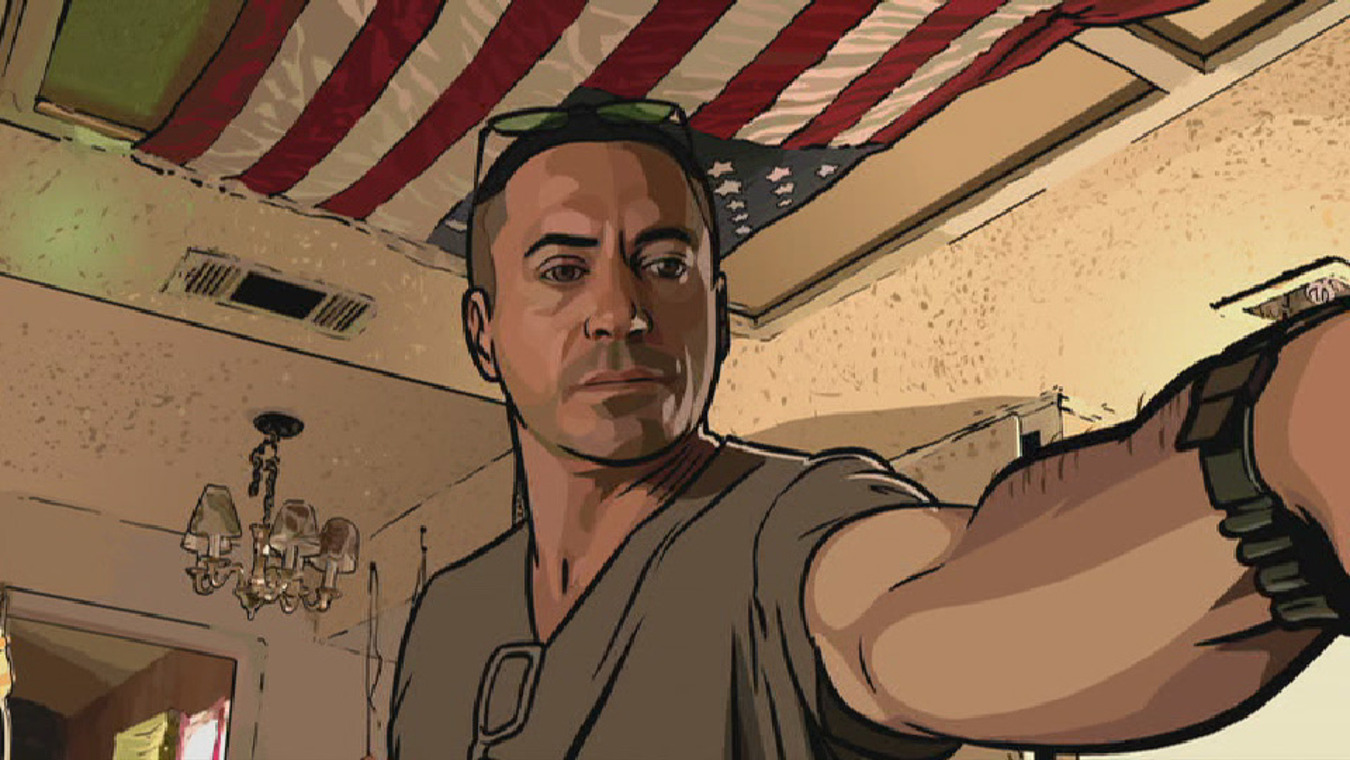
A frame from the movie A Scanner Darkly -
Large cylindrical objects have larger strokes than thin cylinders.
This shows up in many ways. For example, strokes on legs are thicker than on arms which are thicker than strokes on fingers:
Strokes on forearm bulges are thicker than at the wrist.
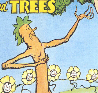
Strokes are thinner above the cheekbone. In each of these examples, the strokes get thinner above the character’s cheekbone. Here’s a 3D rendering with our algorithm:
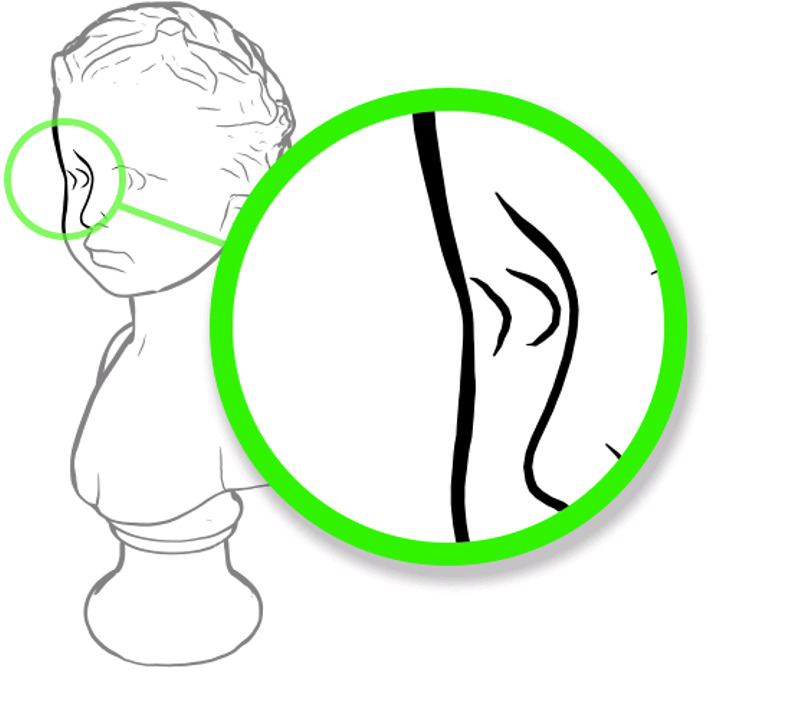
Once I noticed this, I was able to find many more examples:
One nuance of this model is that thickness depends on curvature in the view direction. This means that foreshortened objects will have slightly thicker strokes than if they weren’t foreshortened. I’ve found a few examples that seem to show this, but it’s pretty subtle.
-
Stroke tapering depends on occlusion.
Here is a rendering using our algorithm. Notice that some strokes end at an isolated point. In these cases, the stroke tapers (thins) out to that point. In other cases, a stroke ends where another object covers it; in this case, the stroke doesn’t taper. For example, the thick stroke on the cow’s belly does not taper where it passes under the leg:
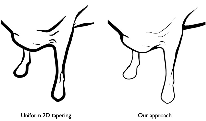
In contrast, things look more awkward if we taper all strokes uniformly. This tapering is pretty common in artists’ drawings, and can be seen in many of the drawings on this page.
-
Thickness can depend on lighting.
Strokes are often thicker on the bottom of the object than on the top, corresponding to a light source above the object. We can also capture this in our model (such as in the beetle illustration above).
-
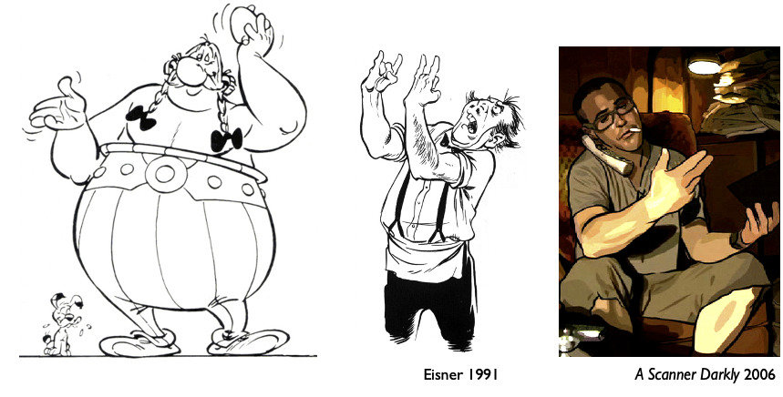
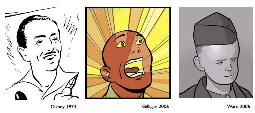
Interior strokes tend to be thinner than silhouette strokes.
The outer strokes are often drawn much thicker than many strokes in the interior. There is a subtle mathematical distinction that explains this in the model (it’s the difference between occluding contours and suggestive contours). Some artist exaggerate this effect, making the silhouettes much thicker than interior strokes:
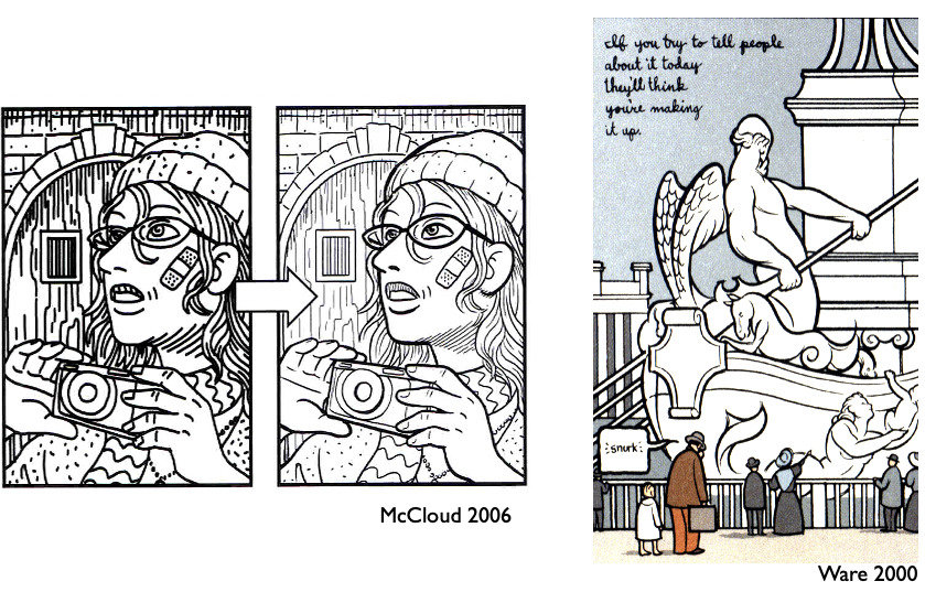
Drawings by Scott McCloud and Chris Ware
Additional notes
One phenomena that our model doesn’t currently represent is that there tends to be a sort of compressed dynamic range in stroke thickness, as if artists care more about relative thickness rather than about following these rules in an absolute sense.
This theory of abstracted shading only works for smooth objects; it’s not entirely clear how it applies to sharp edges, like on a box. Yet, we do see some of these phenomena applying to sharp edges as well, e.g., a distant building would be drawn with thinner strokes than a nearby building.
Finally, I think there is a more formal, testable prediction that we can make with this theory. Specifically, I predict that, if we render line drawings with our stroke thickness algorithm, then viewer will perceive shape more accurately, as can be measured by a gauge task. I think that the difference will be subtle, and the improvement may be largely confined to the areas near the contours. The stroke